Some fun in different studios
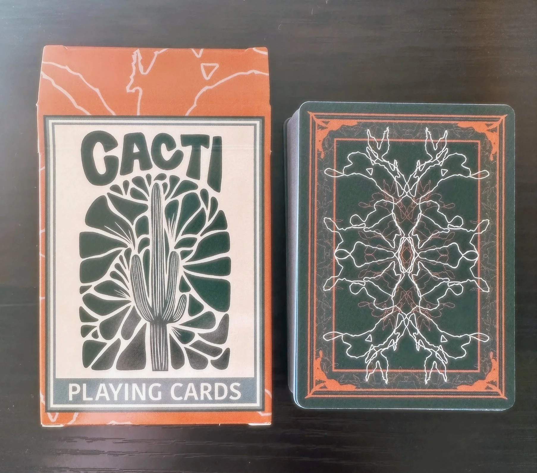
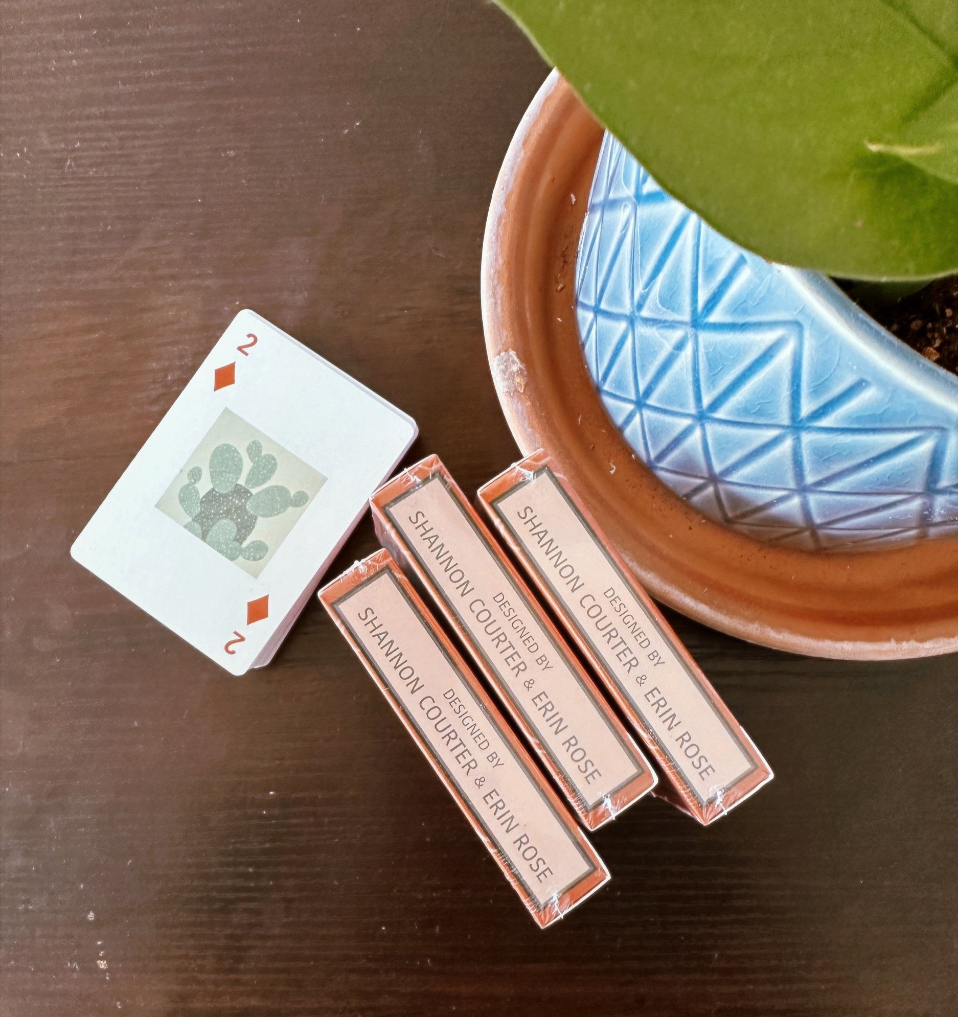
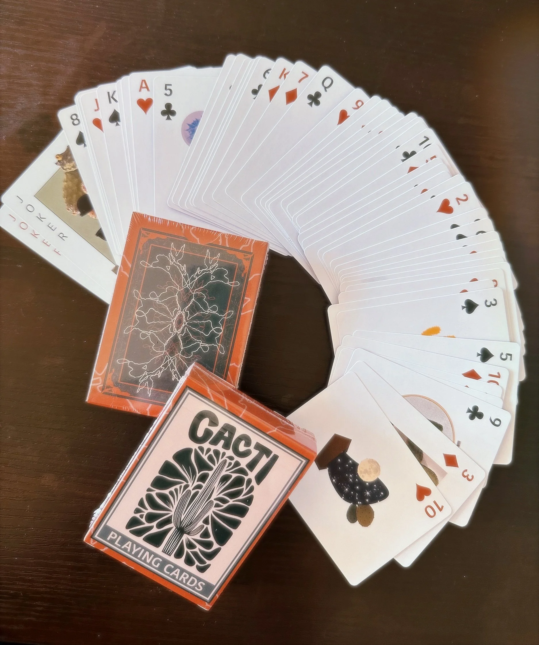
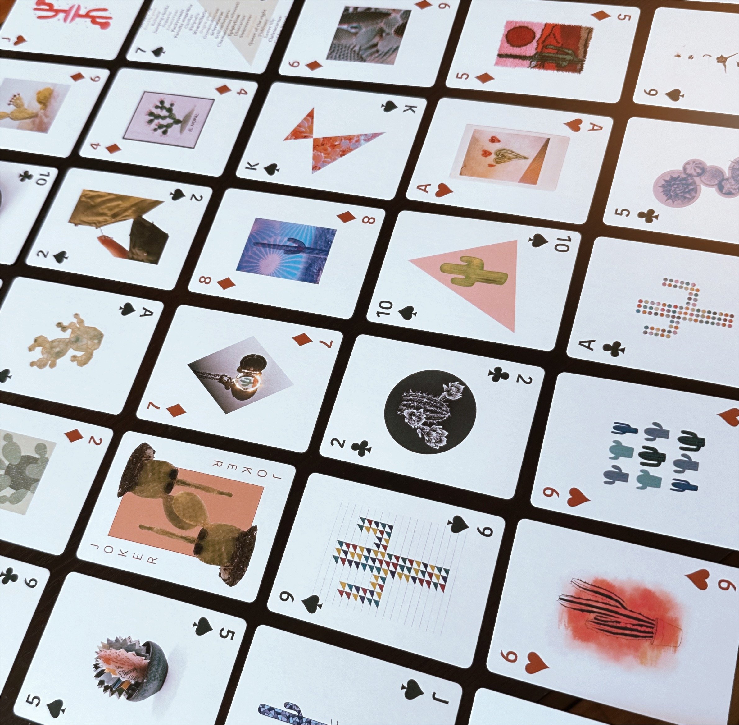
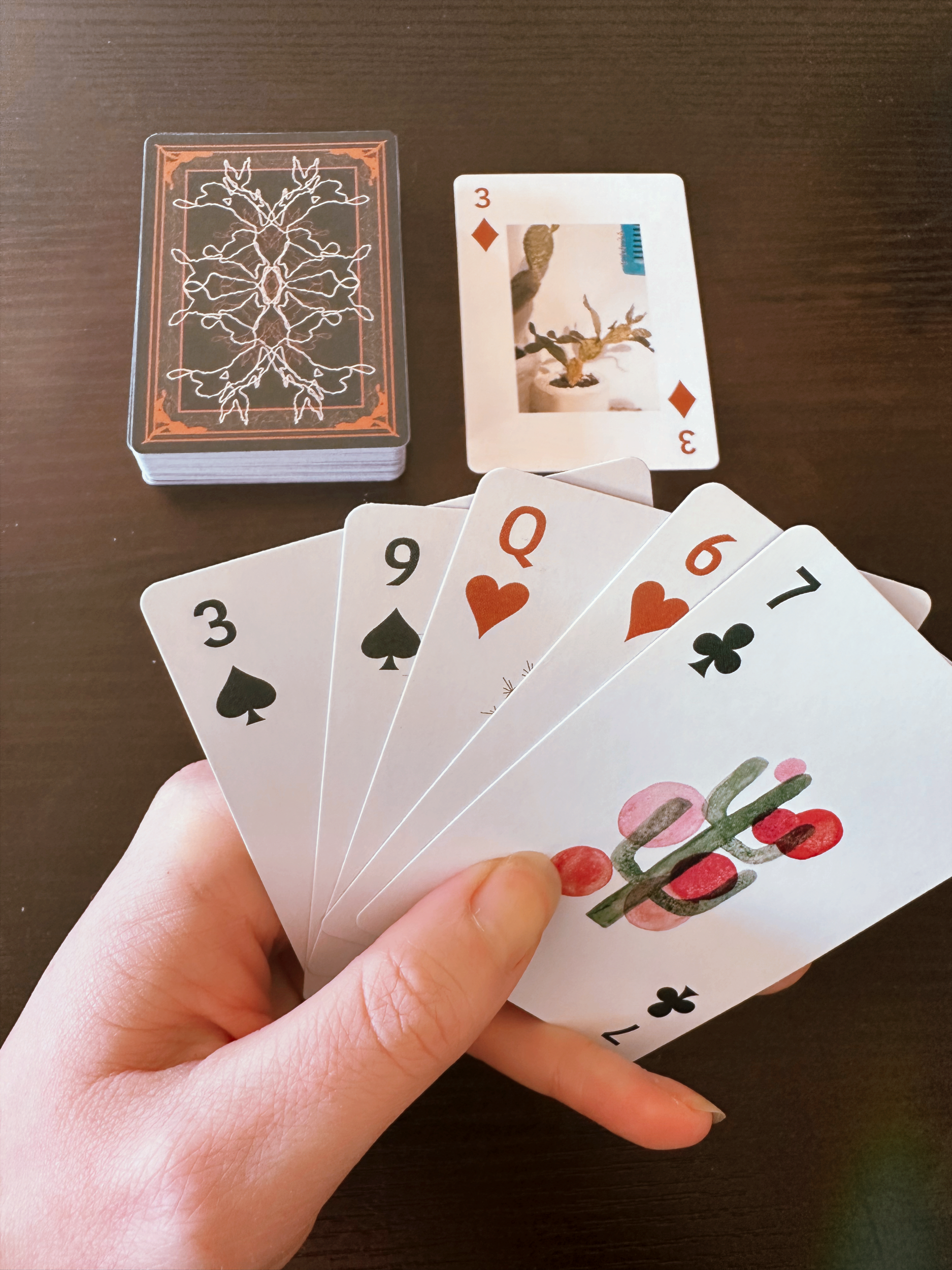
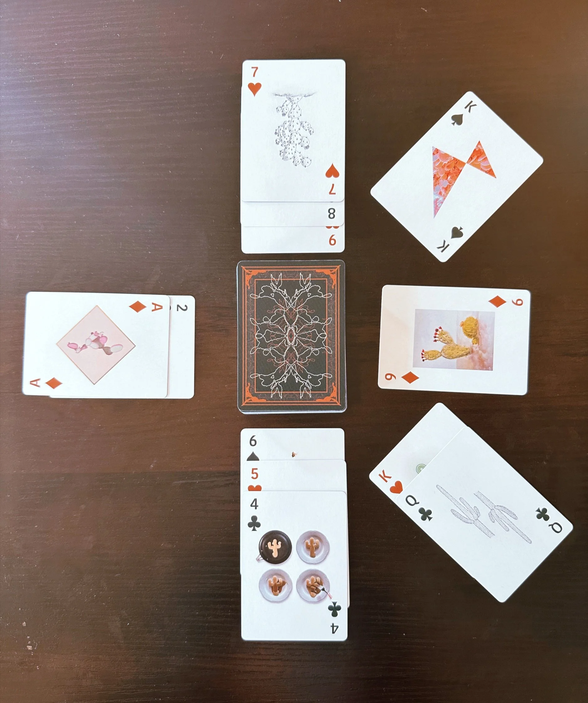
Designed with my friend Shannon Courter, these playing cards feature 56 unique designs and illustrations organized by shapes reflected by the suit.
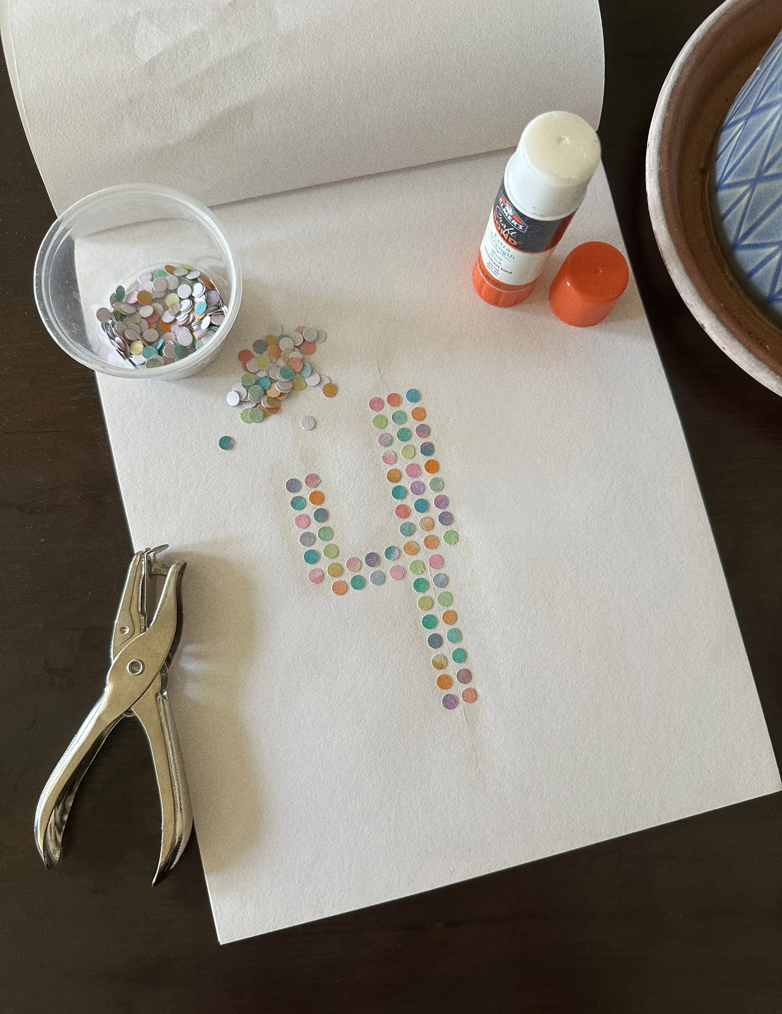
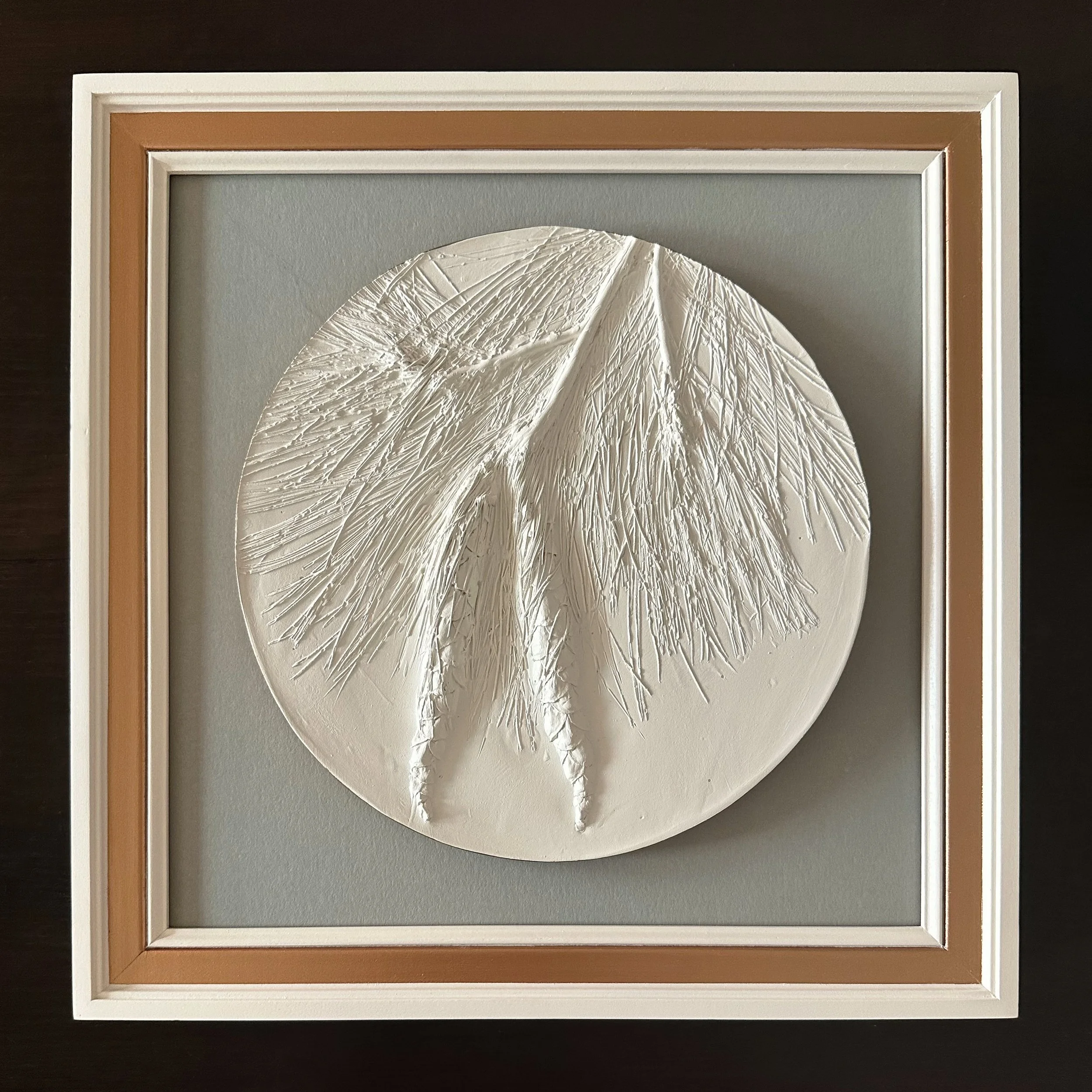
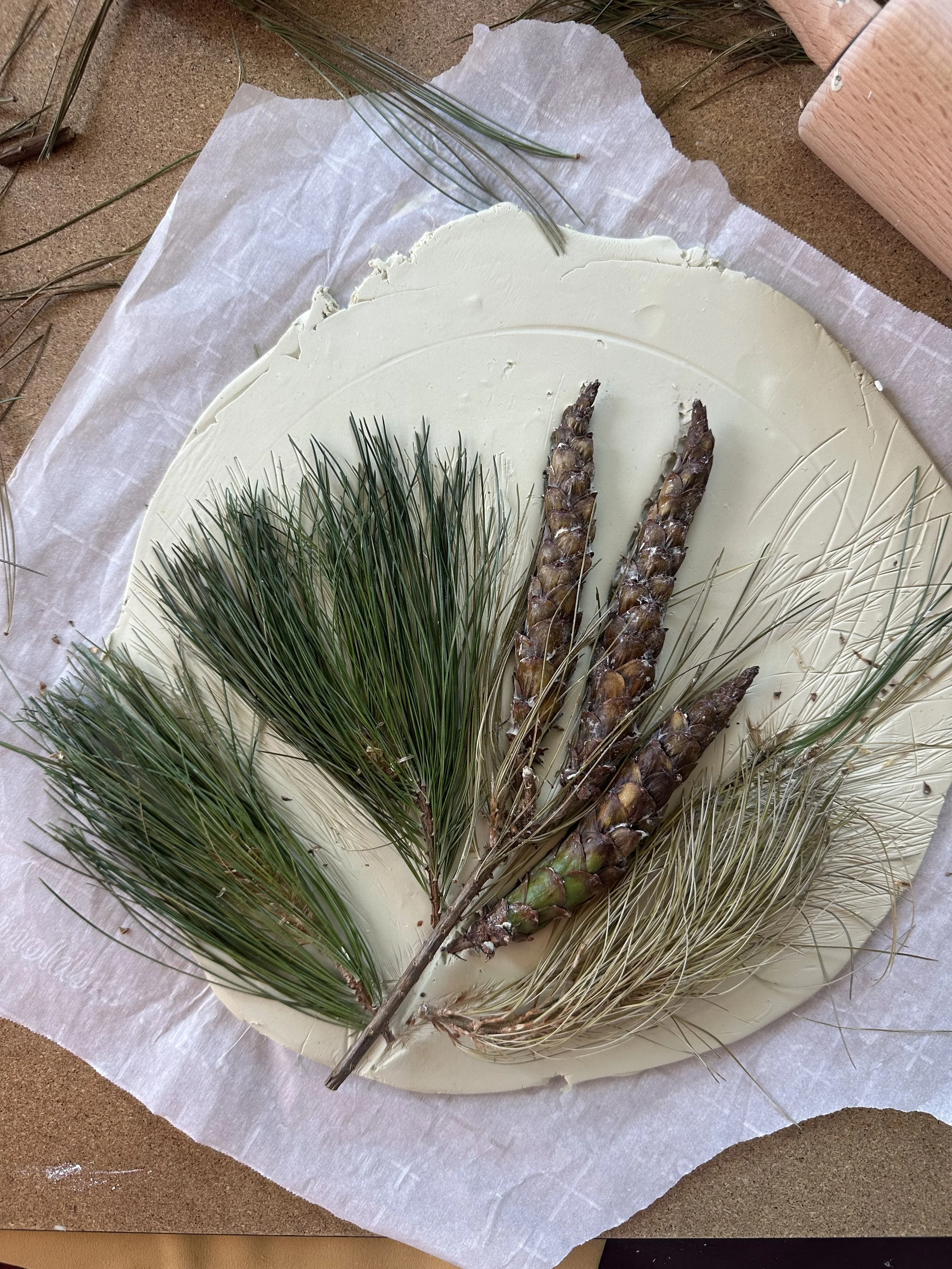
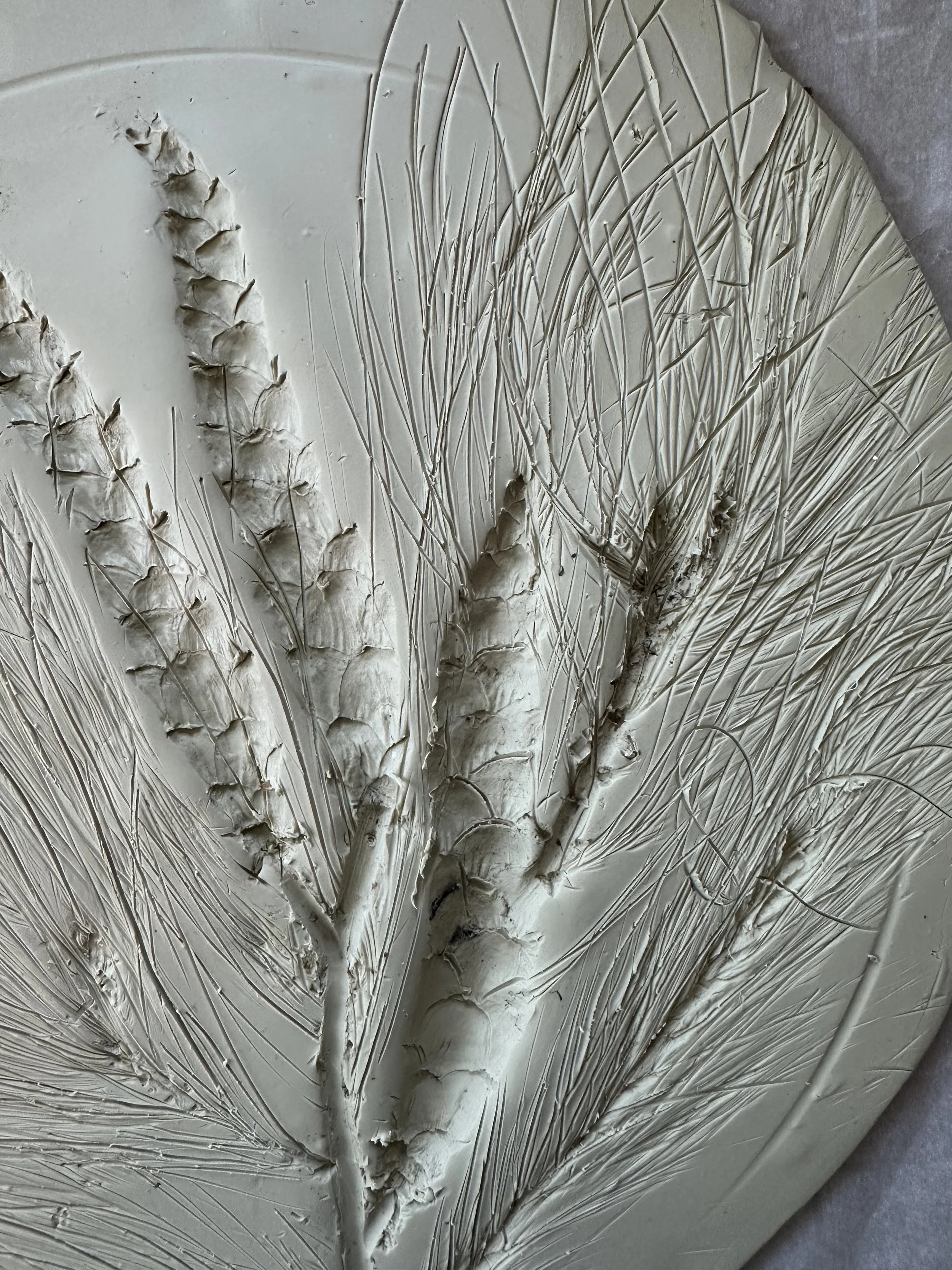
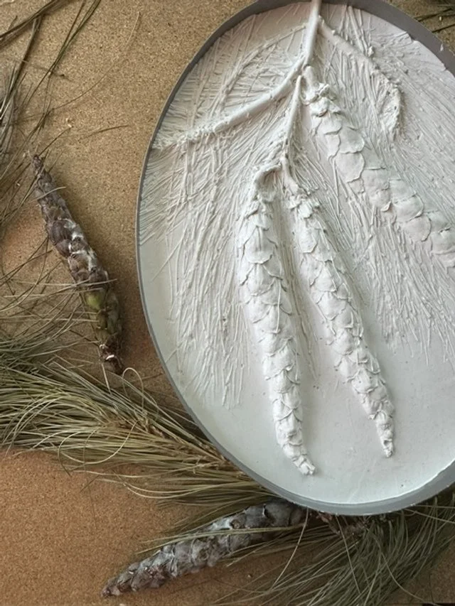
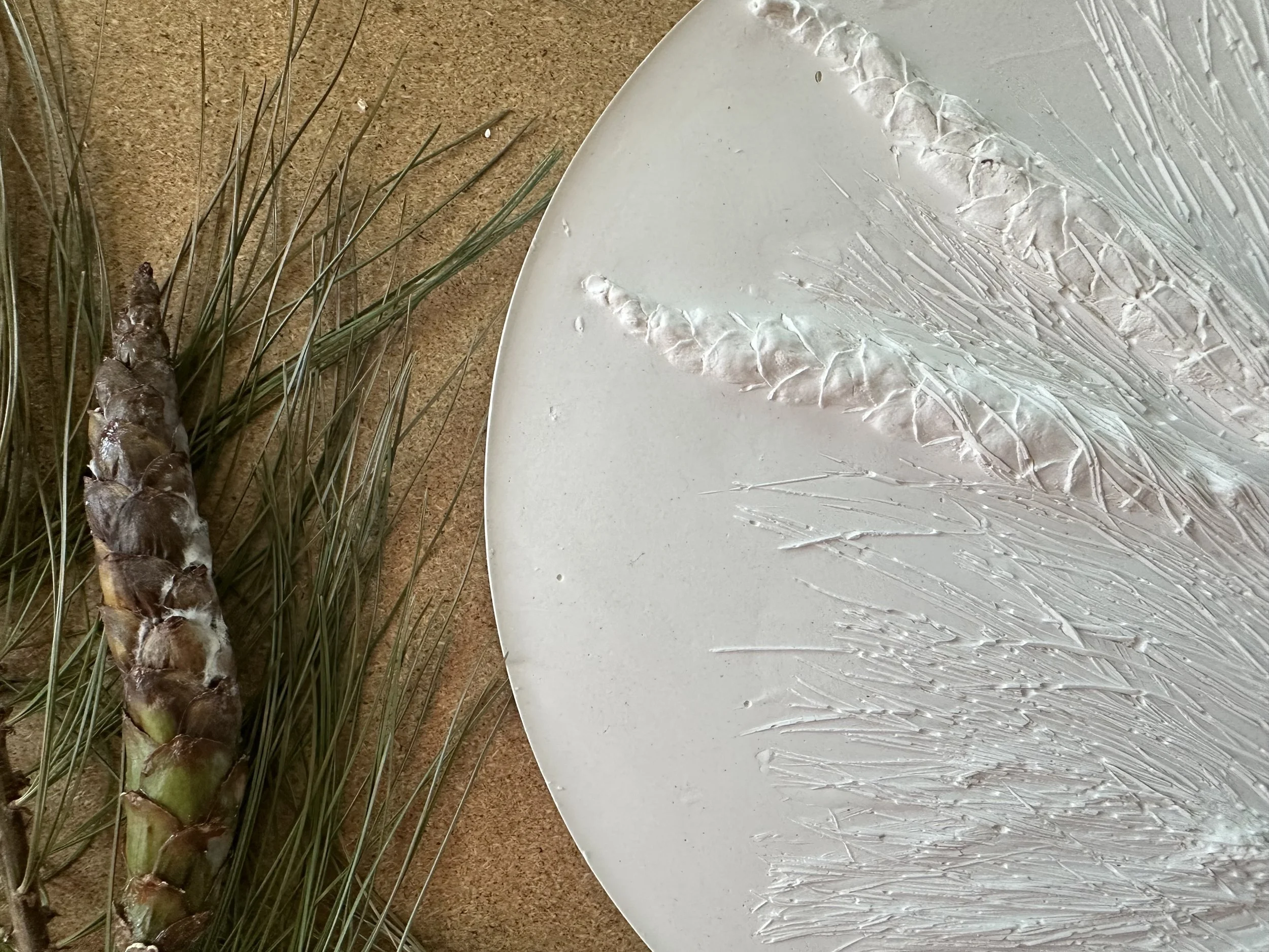
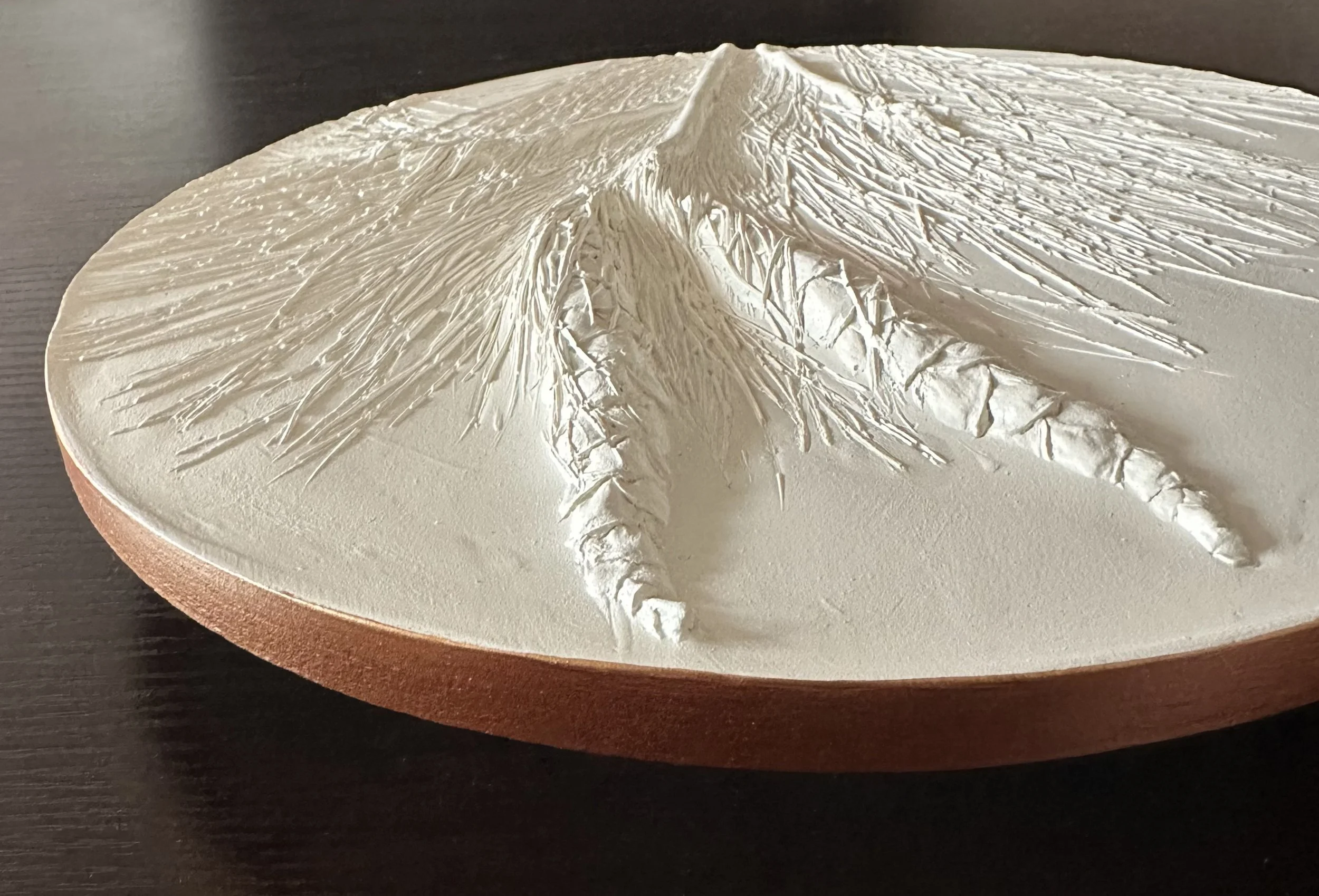
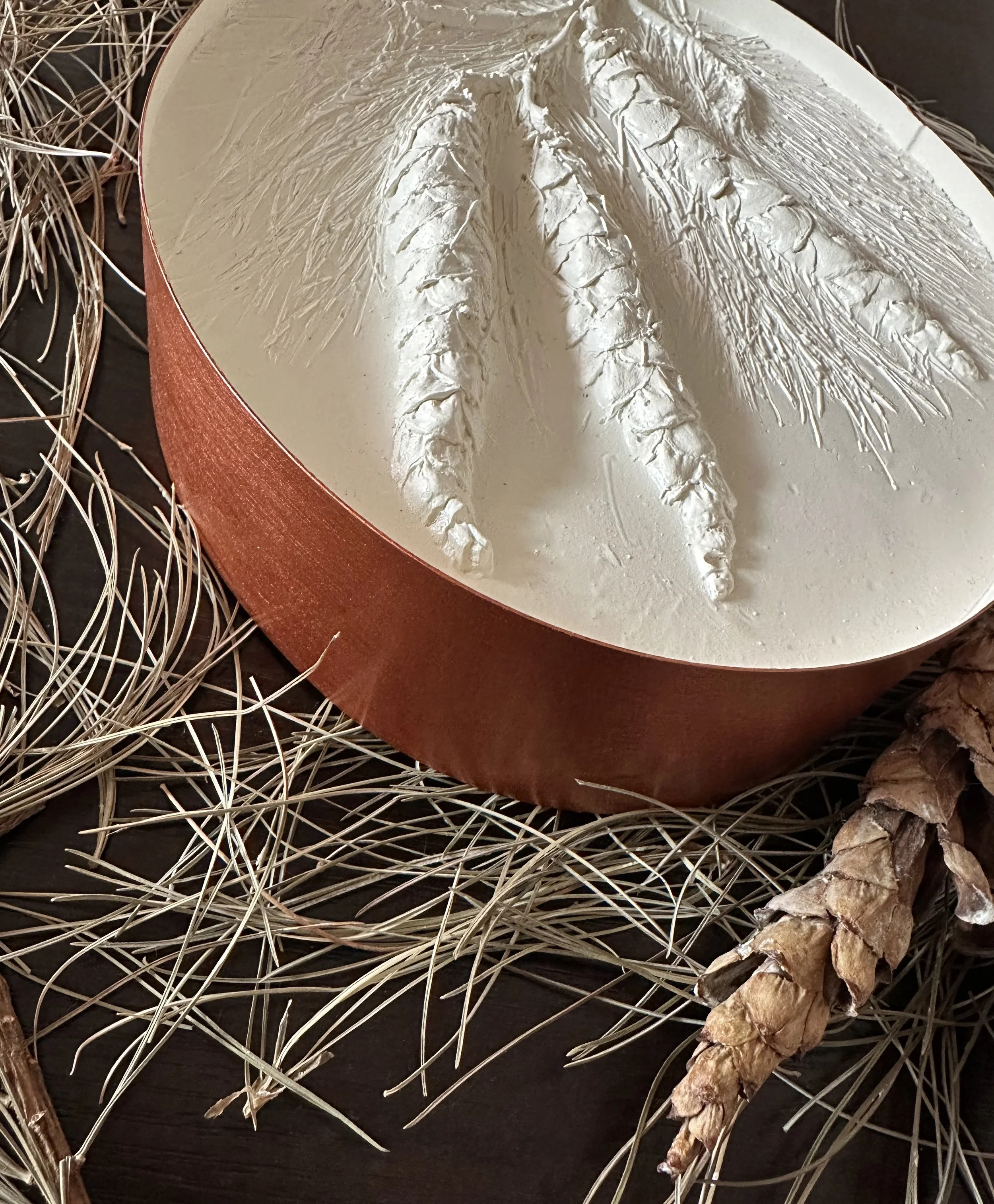
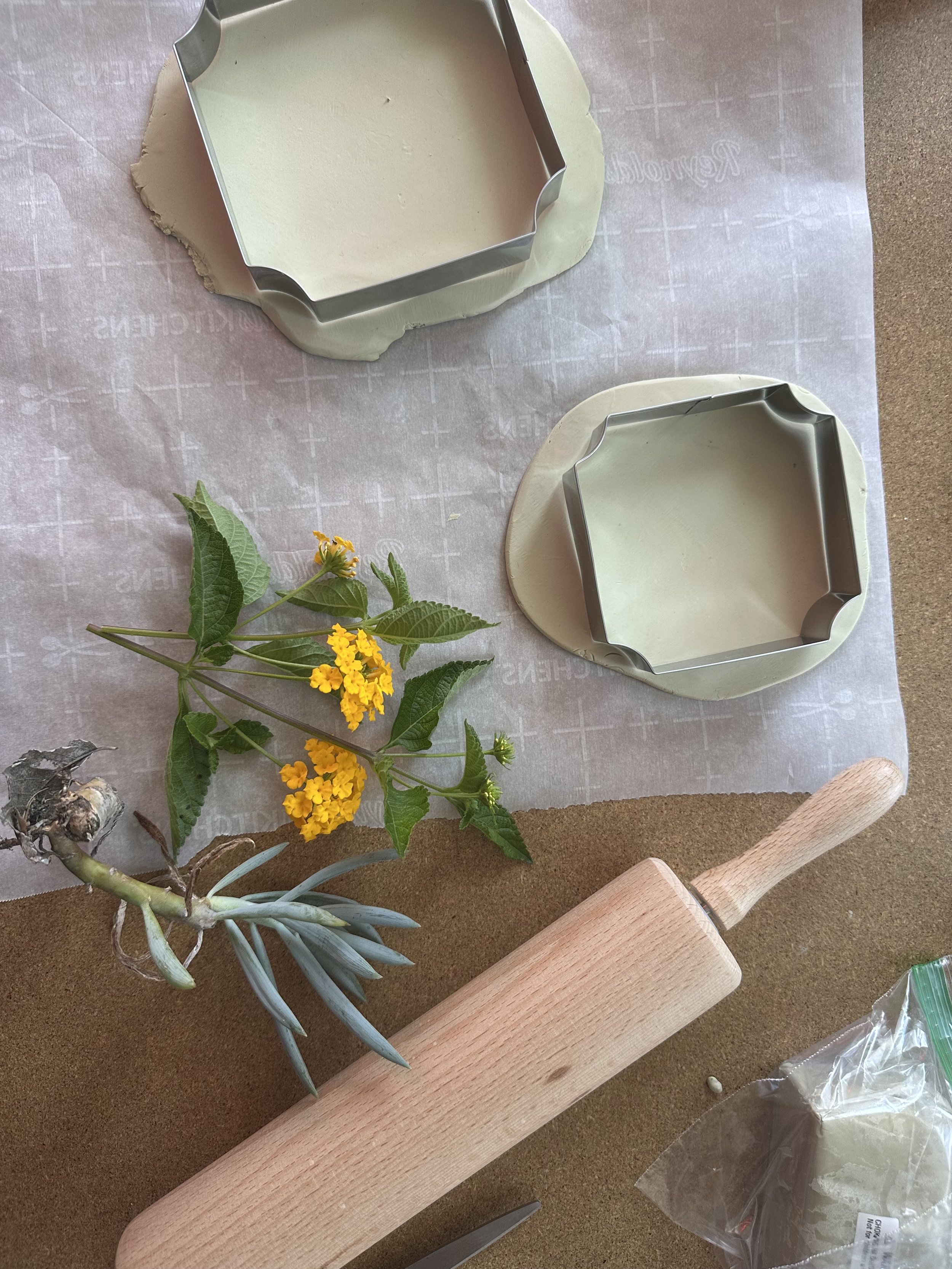
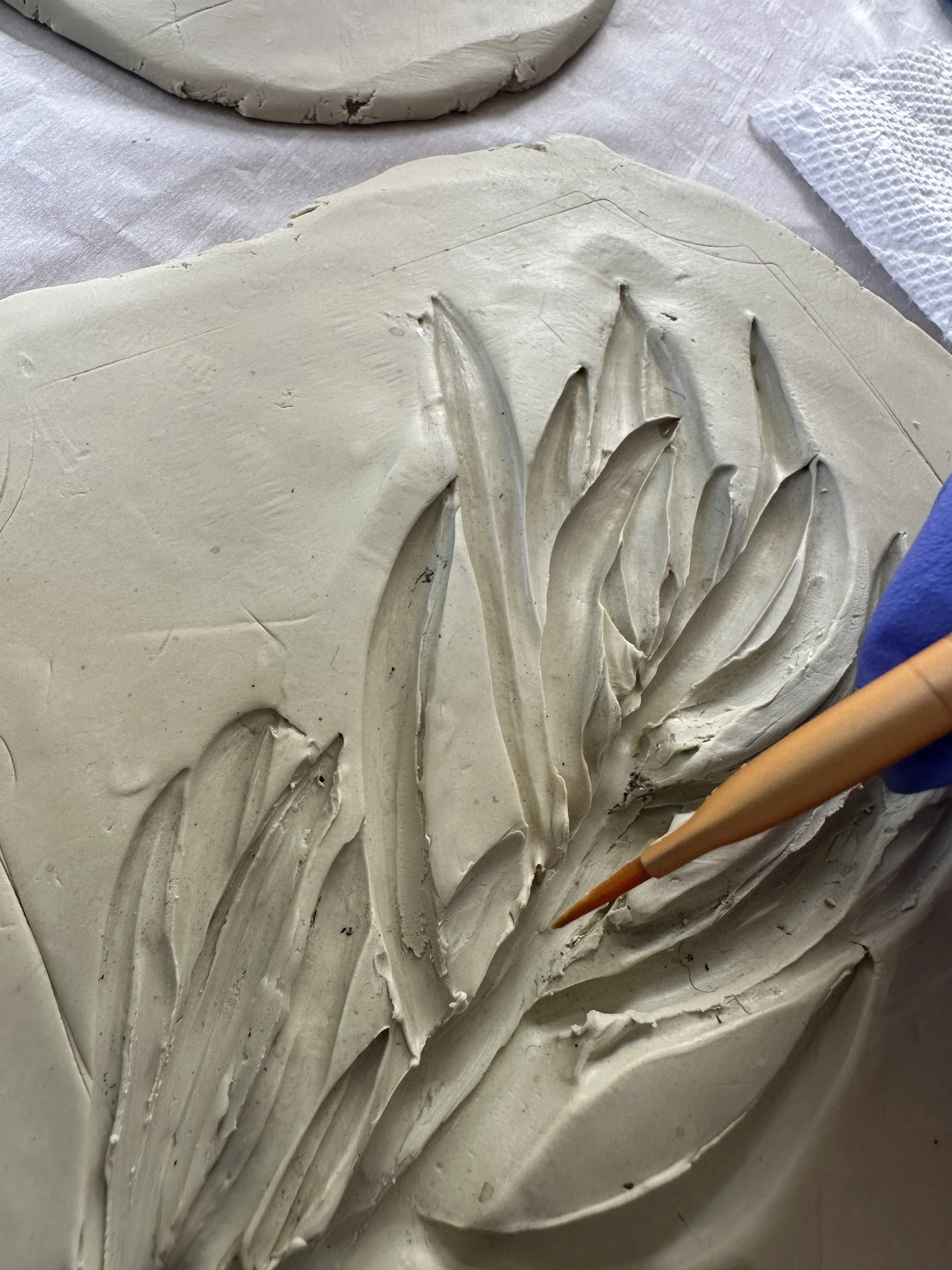
Cleo is a tree from my childhood home and now hangs in our new spaces along with some practice pieces with plants around my neighborhood.
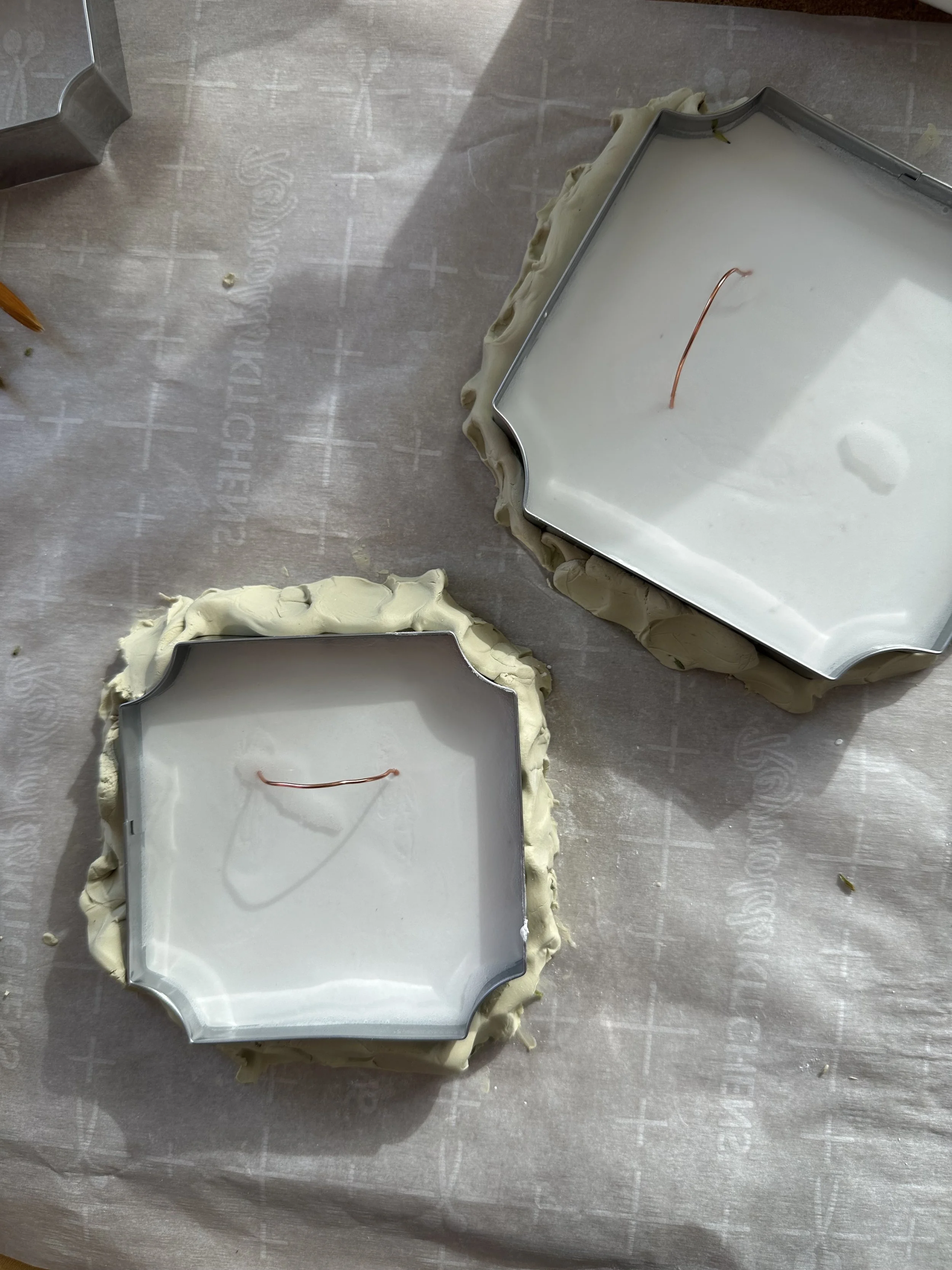
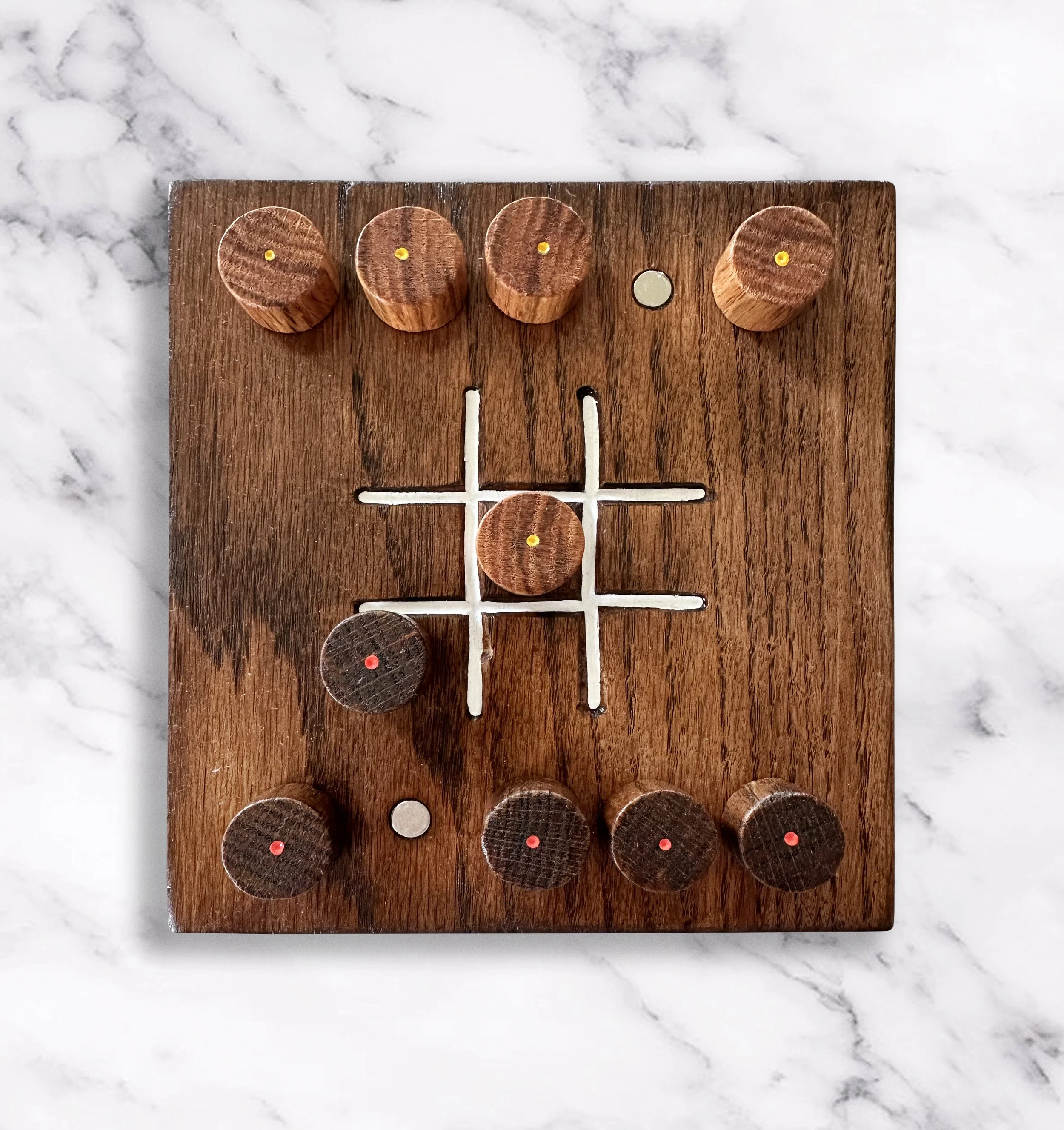
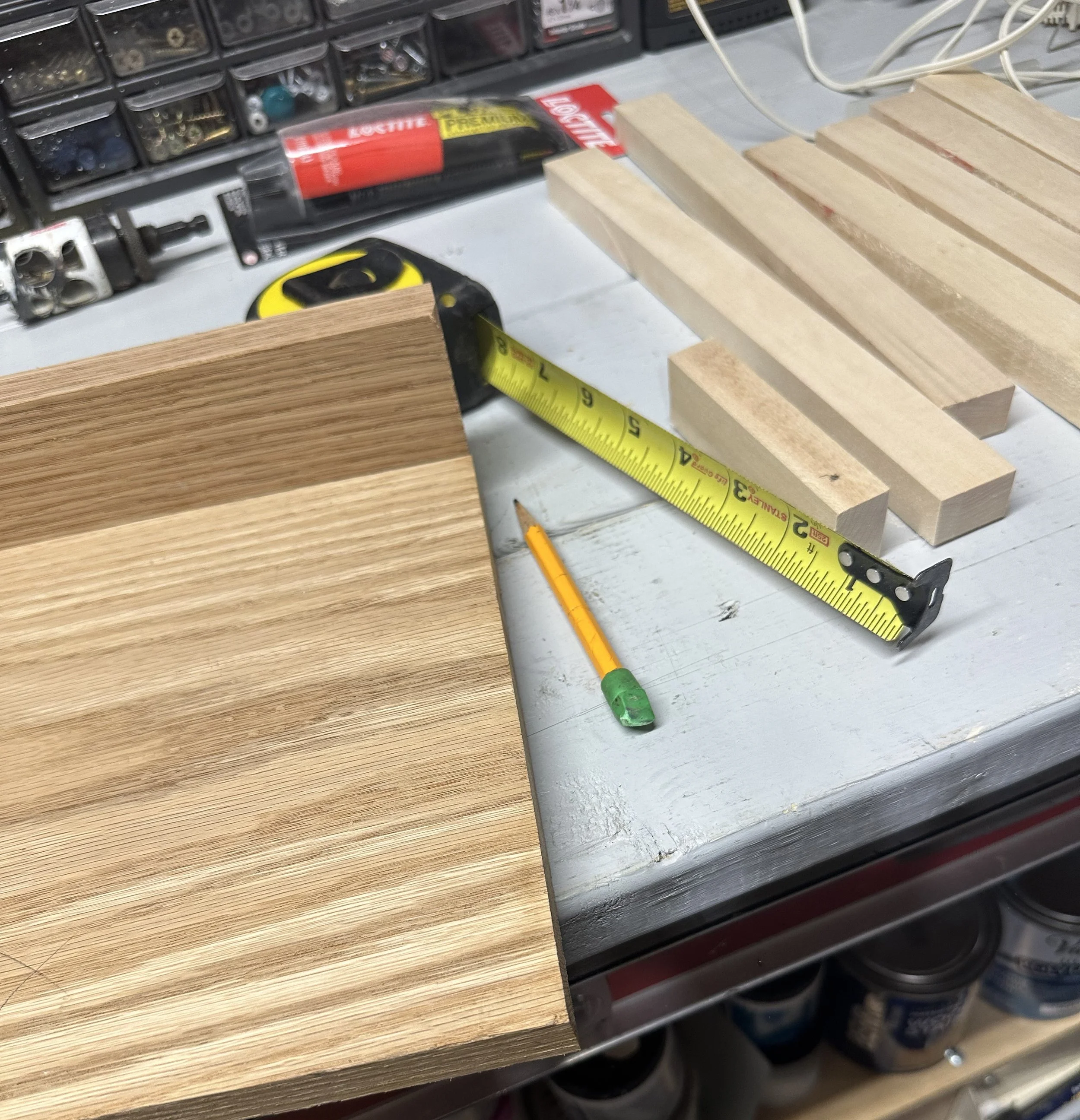
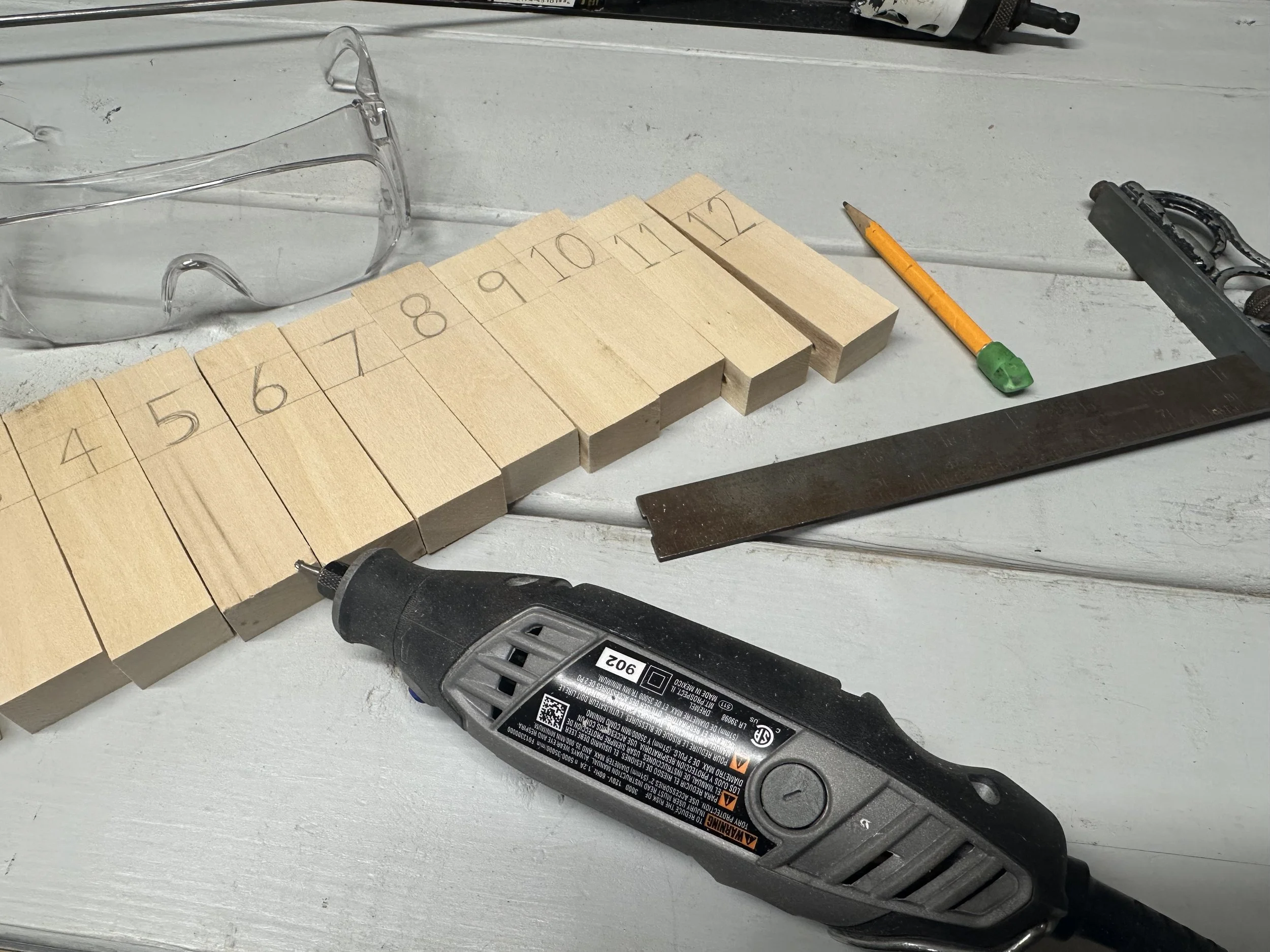
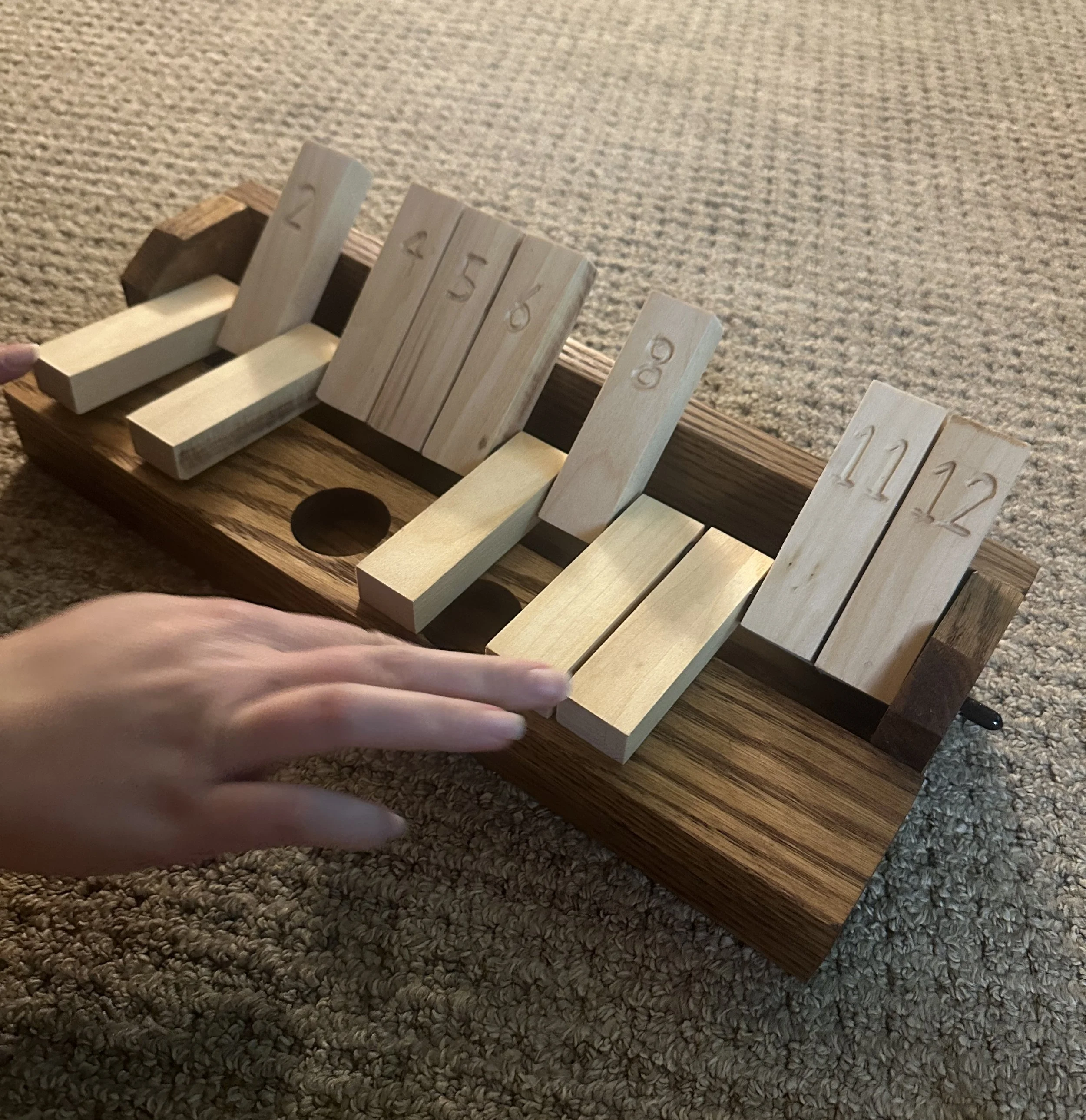
Adding to a growing group of homemade games, these boards were made with my dad in his woodshop. Two different techniques feature pieces that stay put from small magnets embedded in the wood.
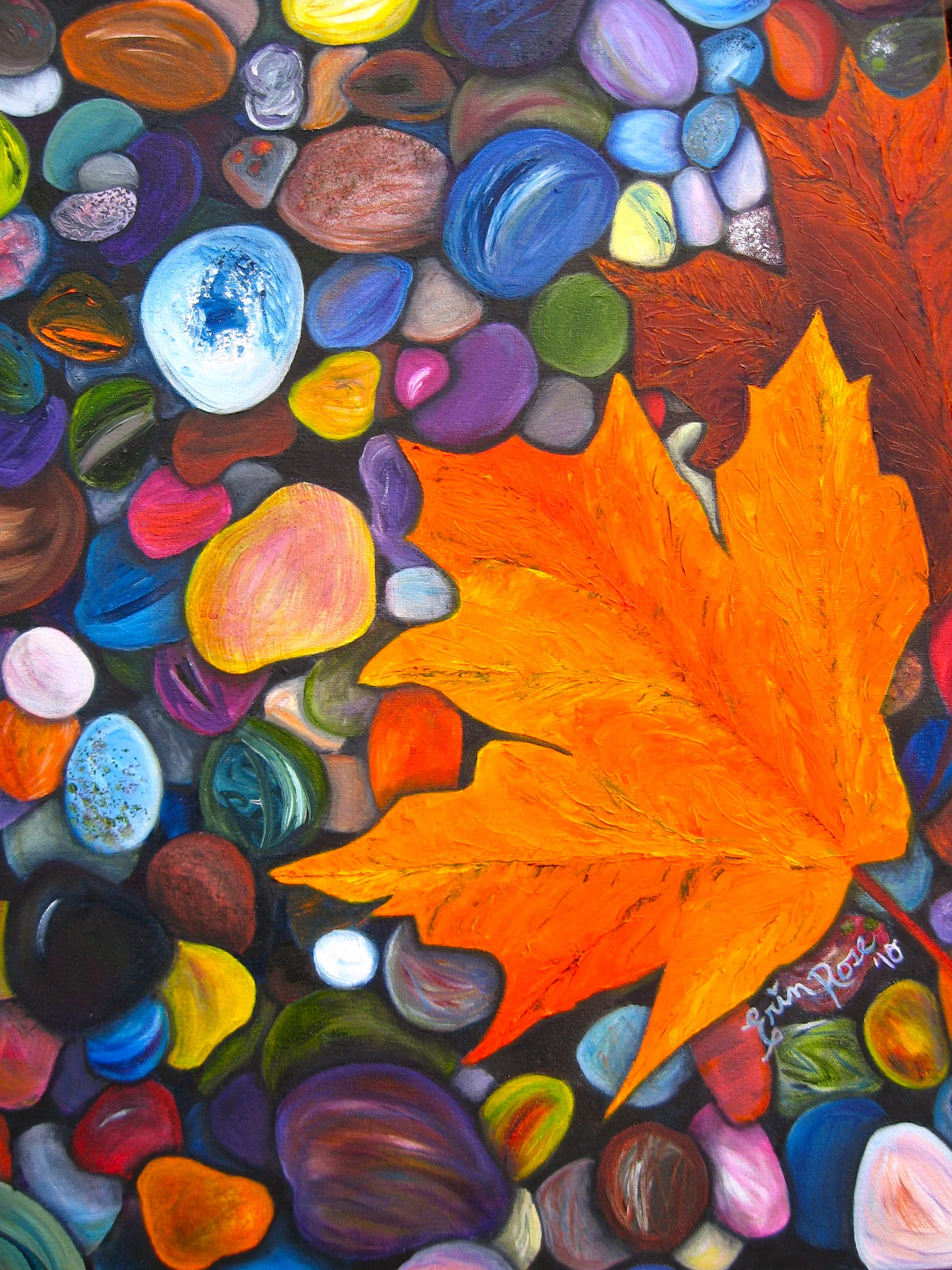
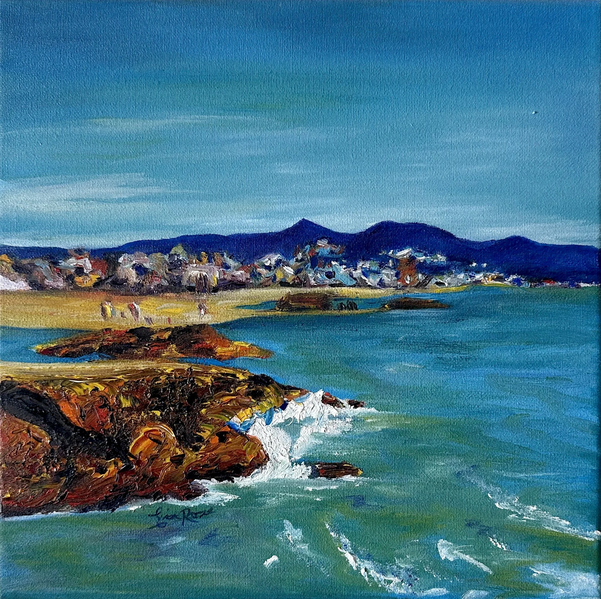
Oil Paint
20in x 24in
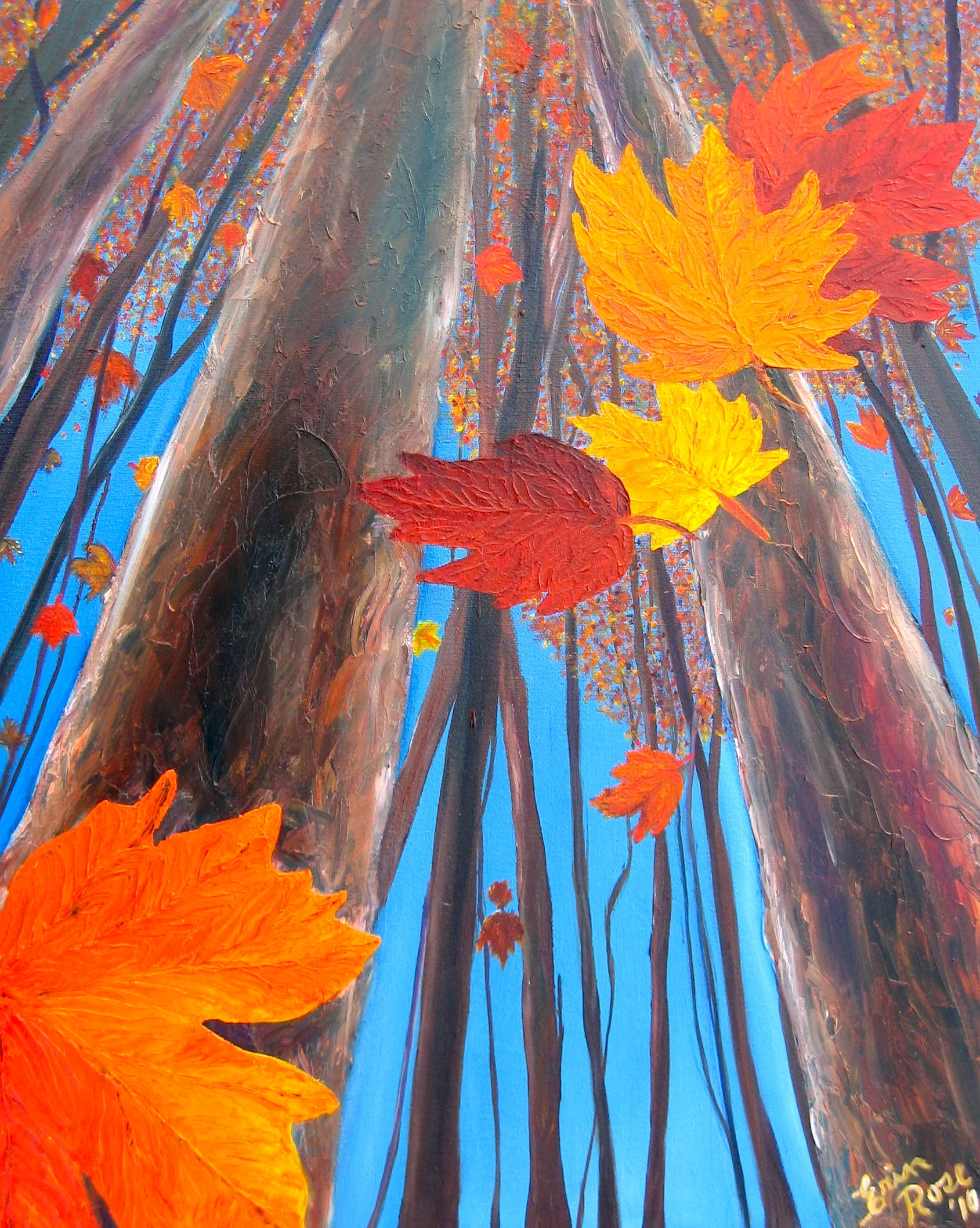
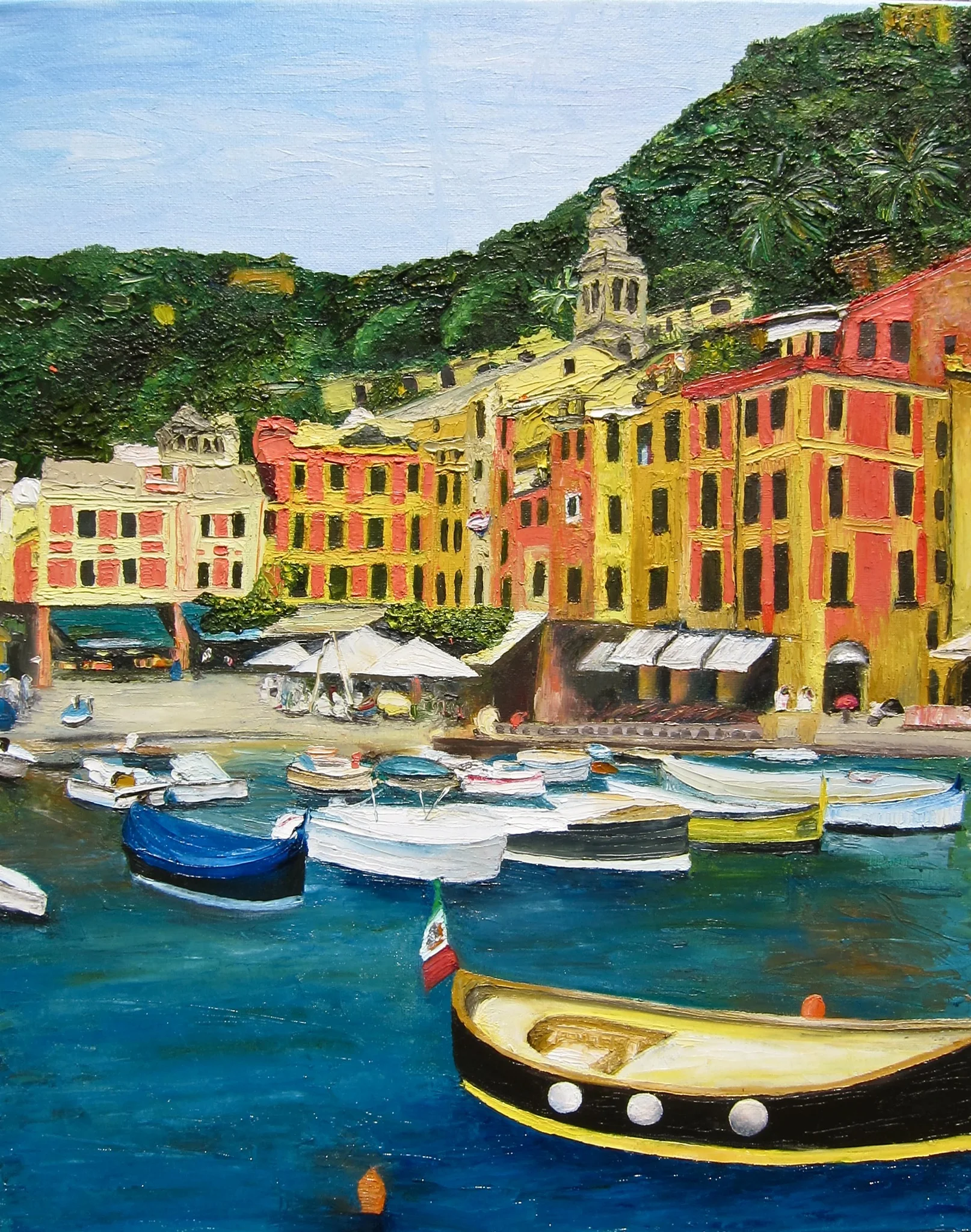
Oil Paint
18in x 24in
My first exploration of the palette knife and my first commission for my 10th grade english teacher.
Oil Paint
18in x 24in
Palette knife
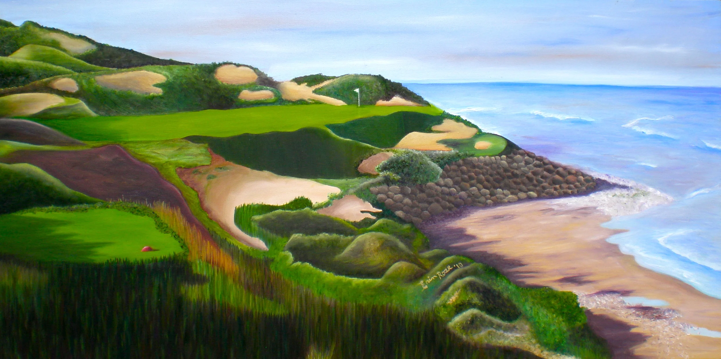
Oil Paint
30in x 16in
A painting for my dad of the 7th hole at his favorite golf course.
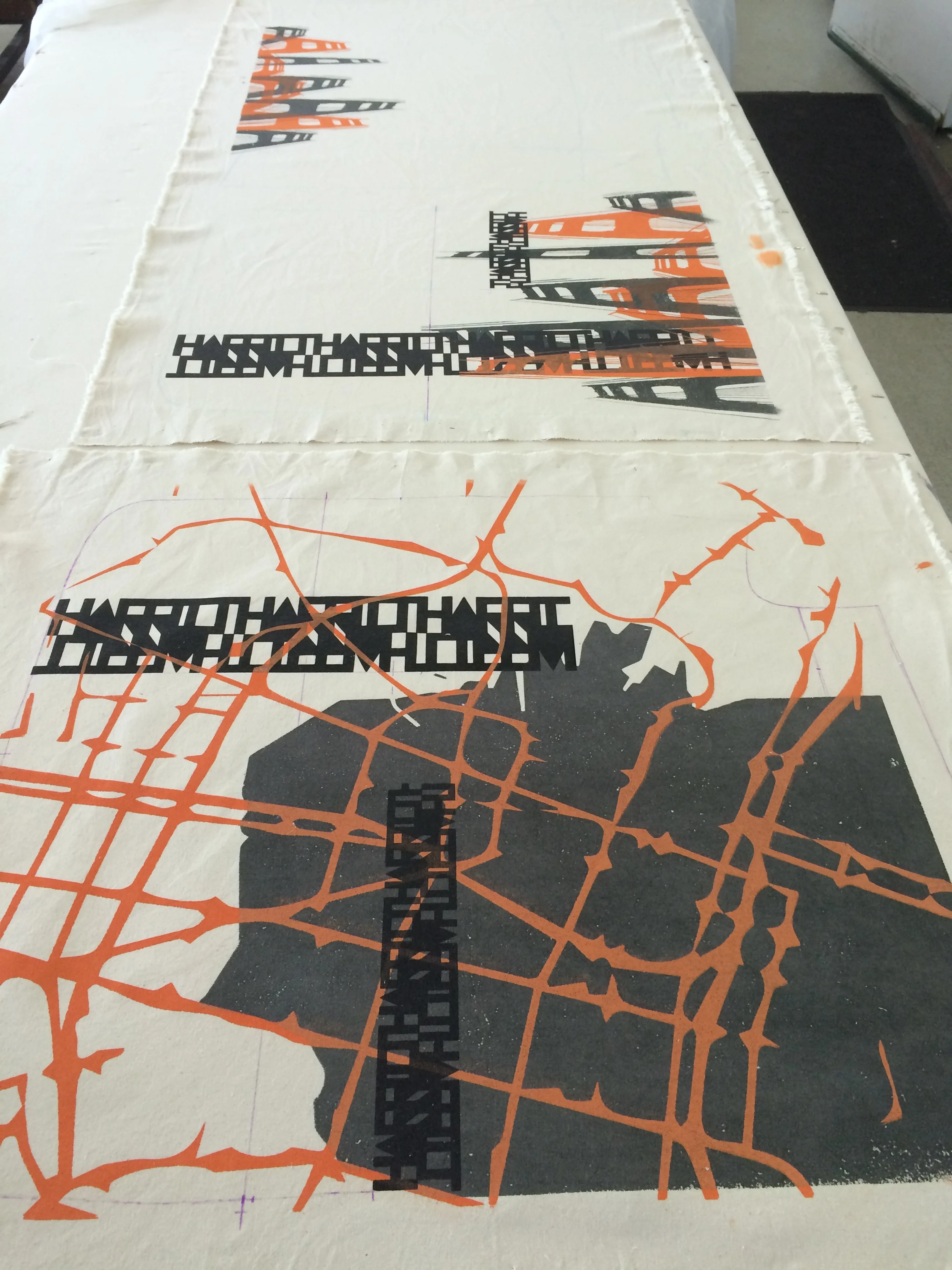
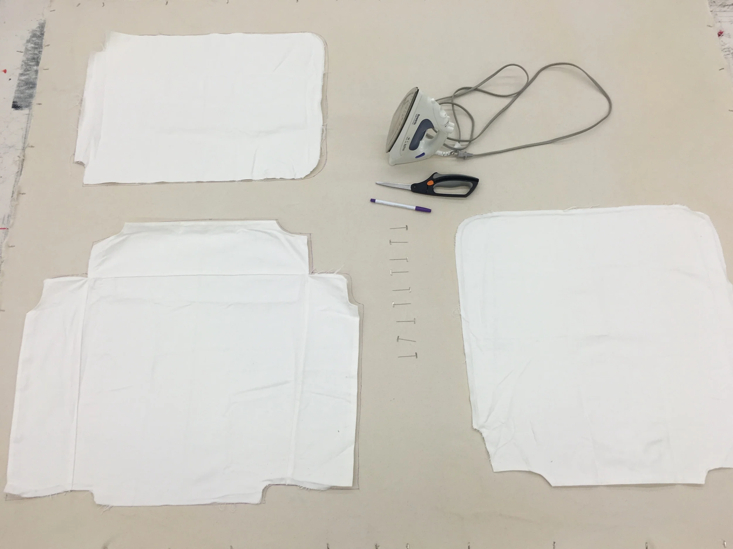
This chair was created as a reflection and memoriam of a semester in San Francisco. The seven silk screen prints are done with both dye and ink. The final three pieces of canvas were sewed and upholstered with a strong focus on the three key matching points: the top, single side, and reflective bottom. Precise measurement was a strong and necessary focus.
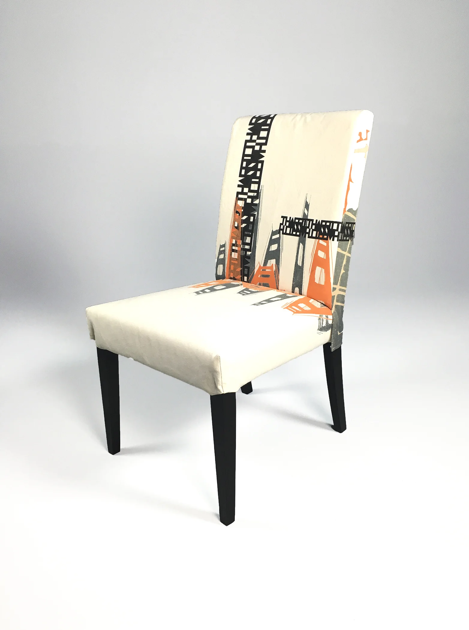
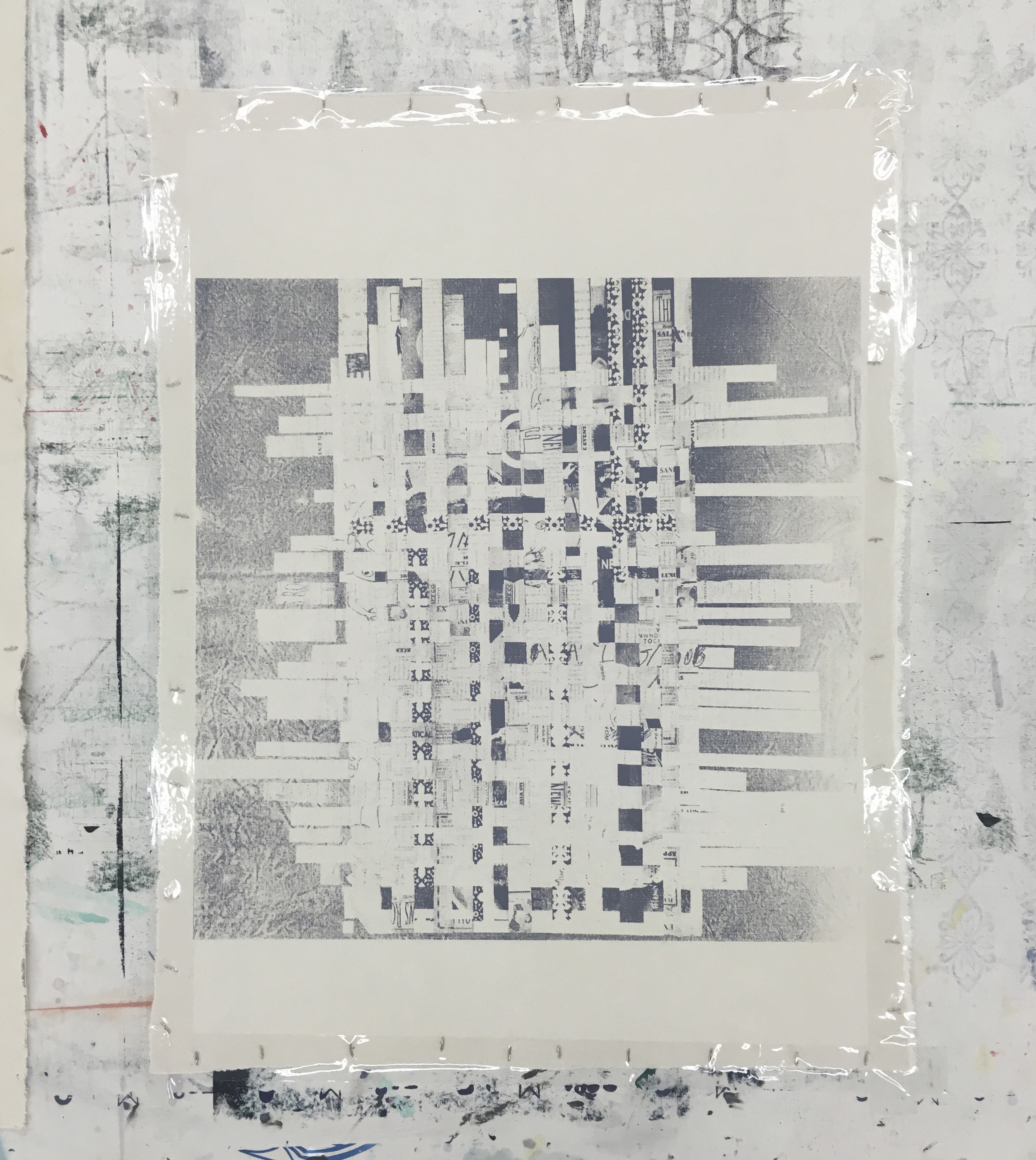
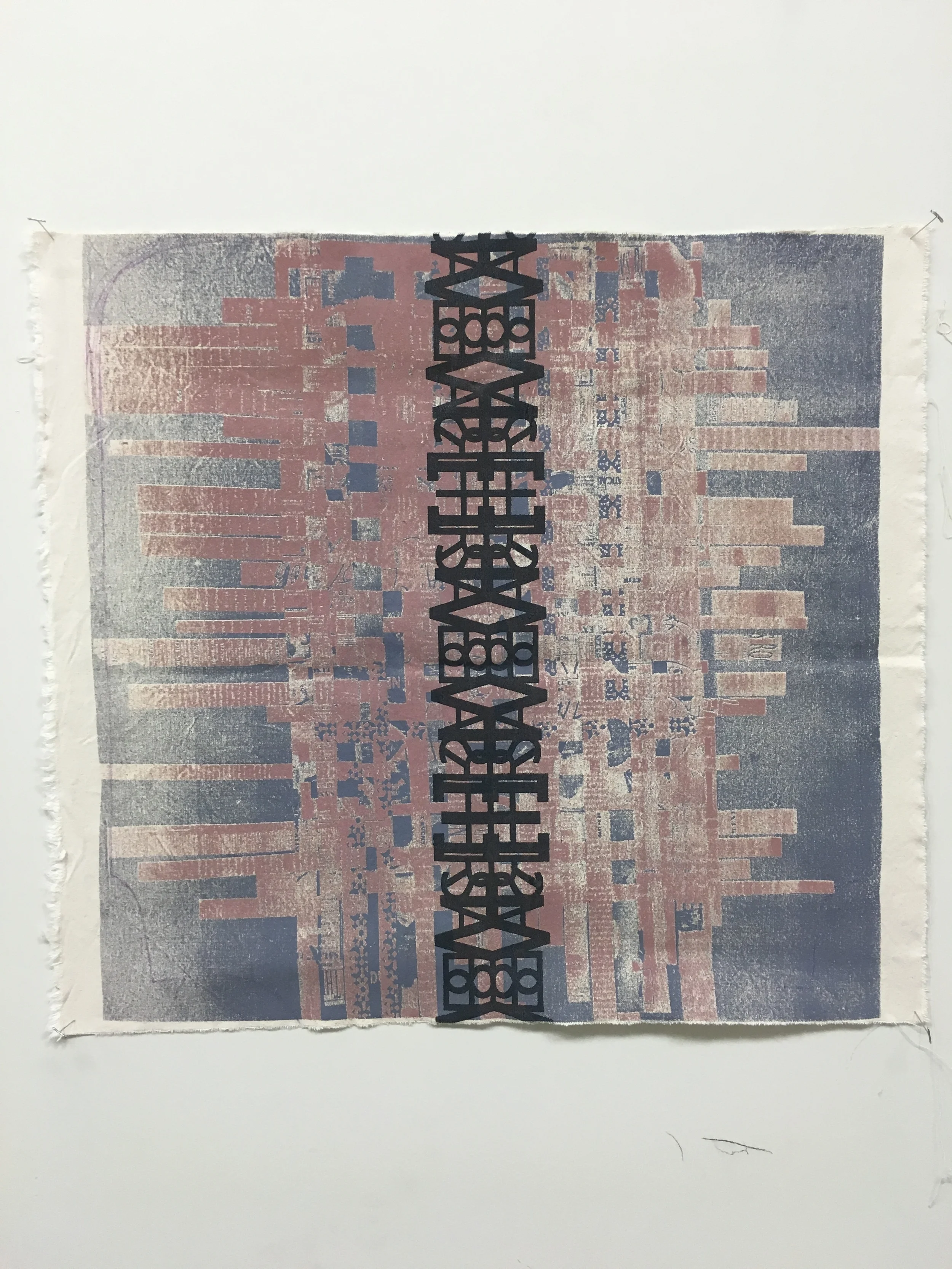
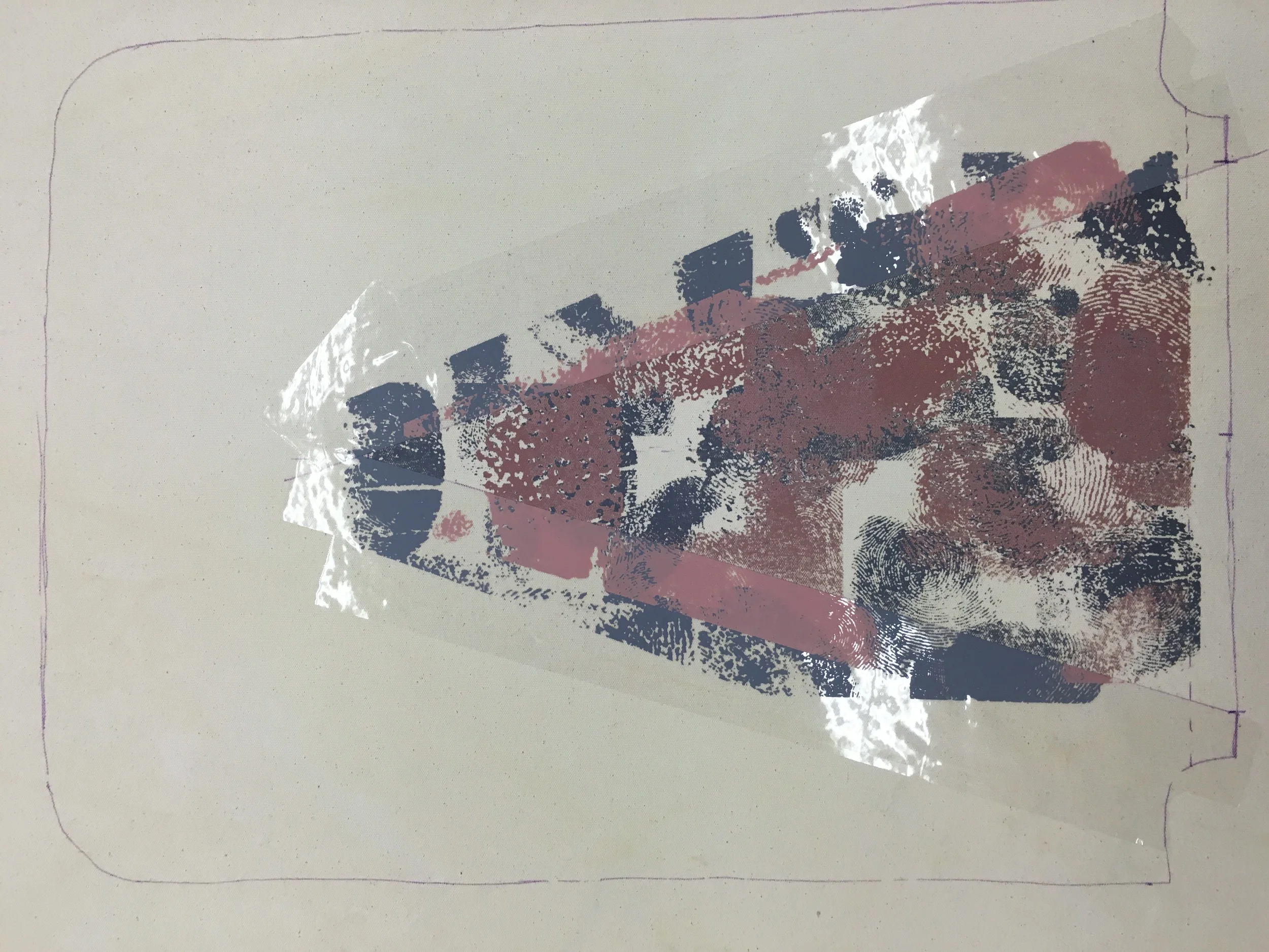
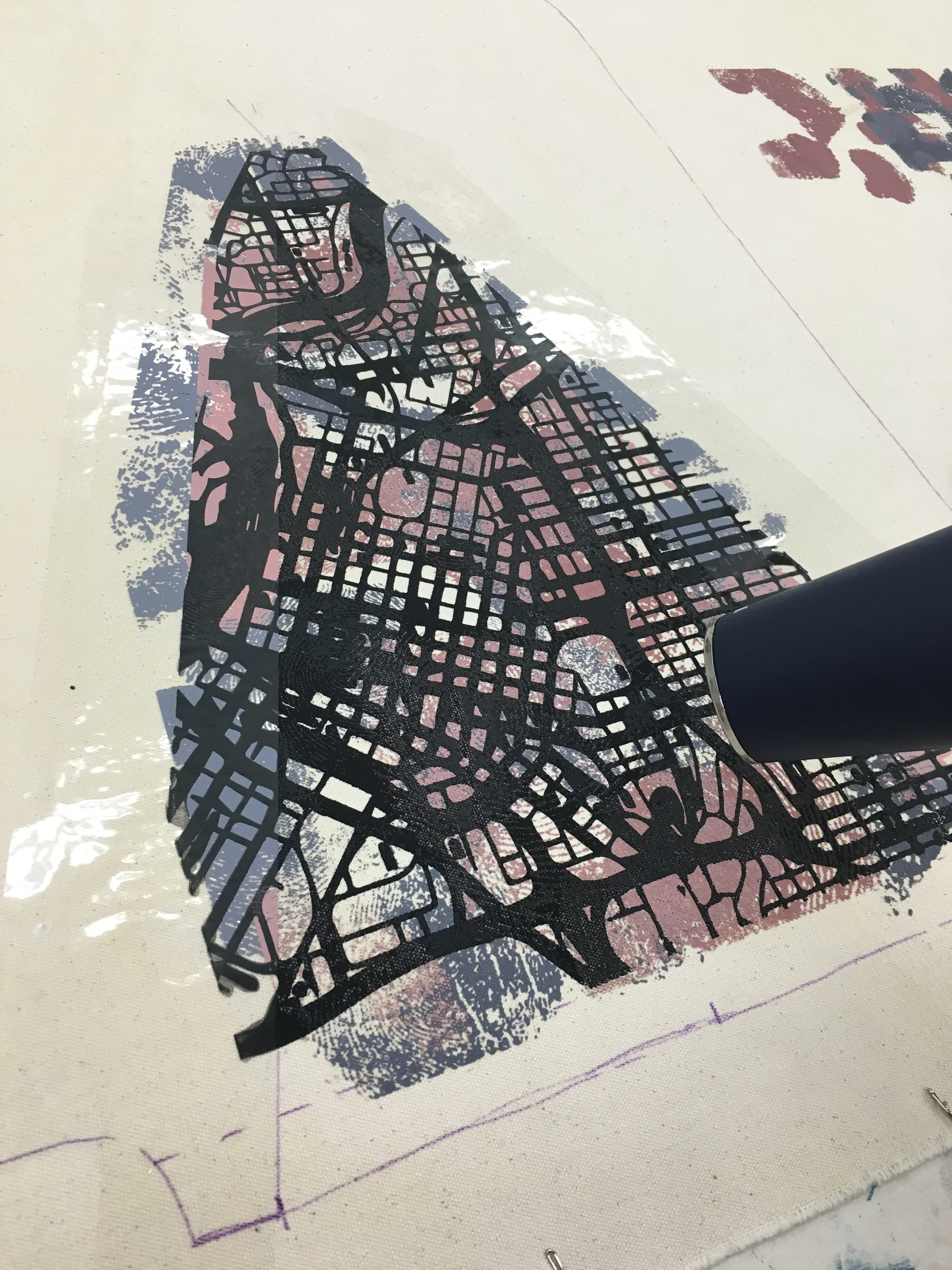
A continuation of a series of hand printed dining chairs that commemorate a city I have lived in. The textures here are created from a map of Minneapolis, the street name I lived on, finger prints from my friends, and a weaving of projects I worked on in college.
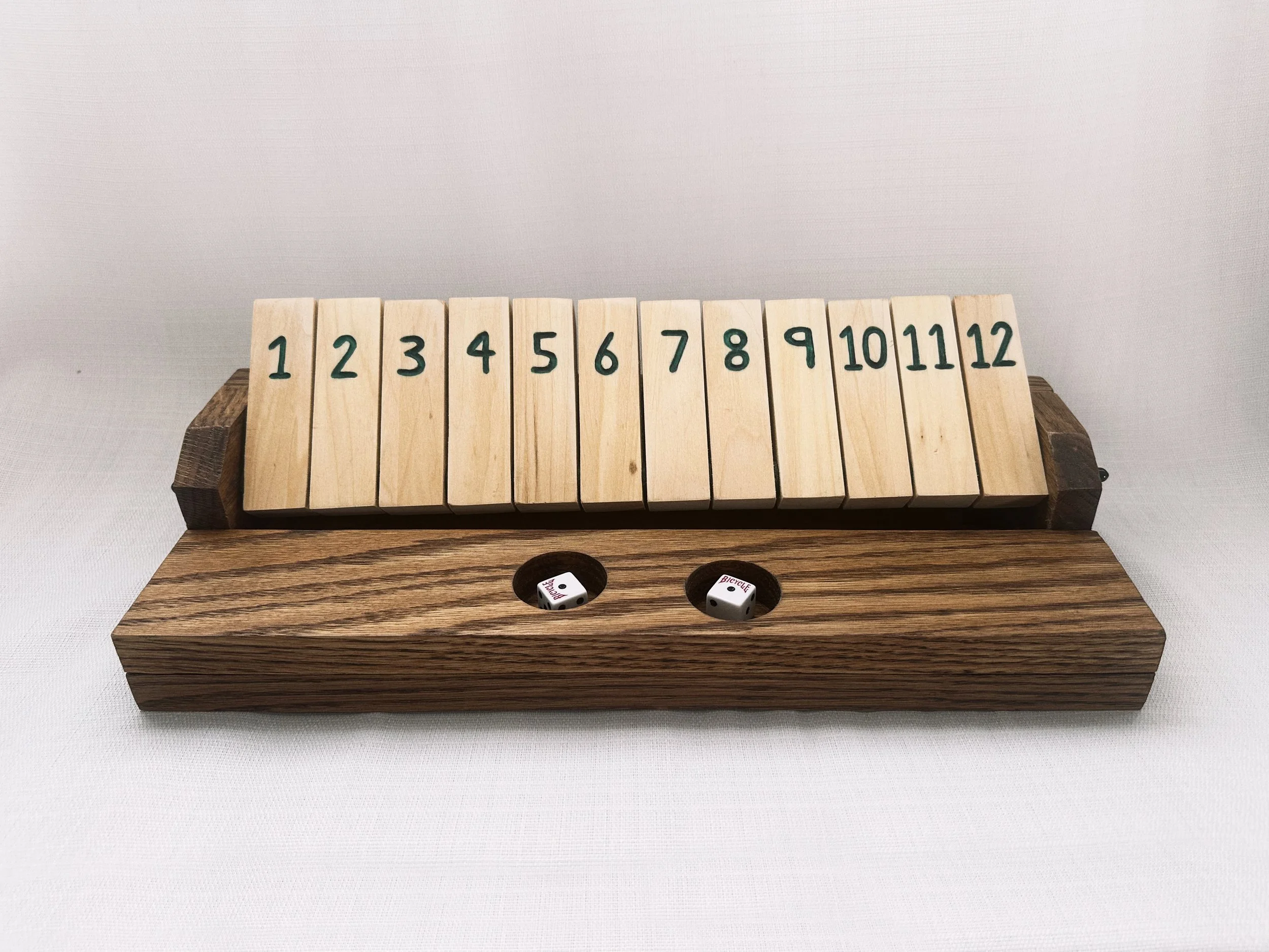
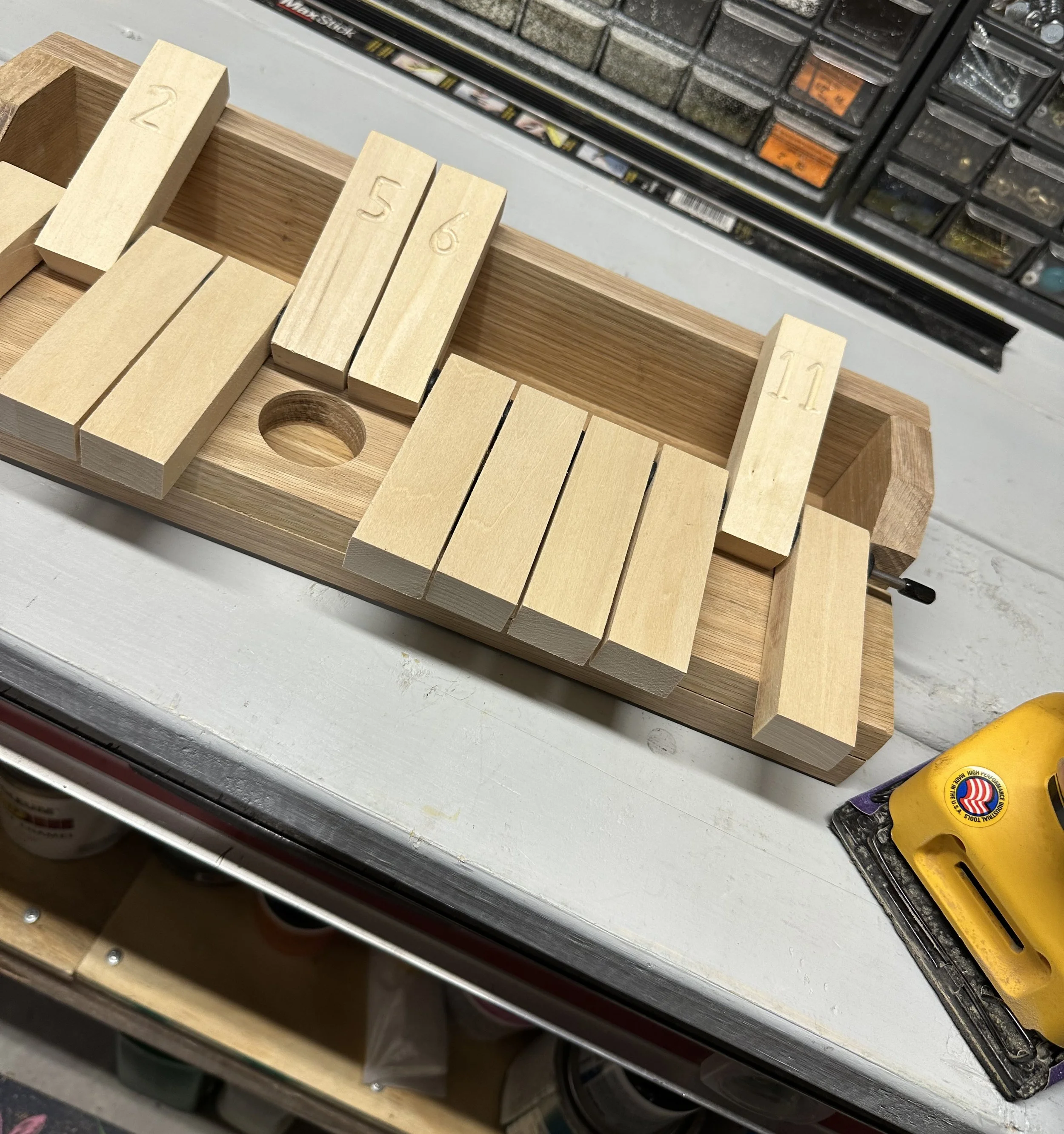
Created from a few scrape pieces in my dad’s wood shop, this homemade bar game features a hard oak base with dice spots and soft birch tabs held up by a metal rod.
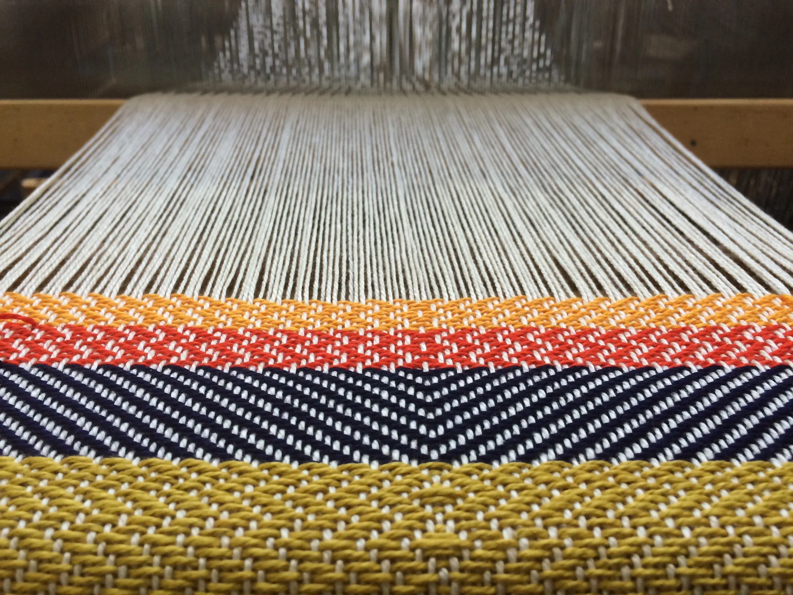
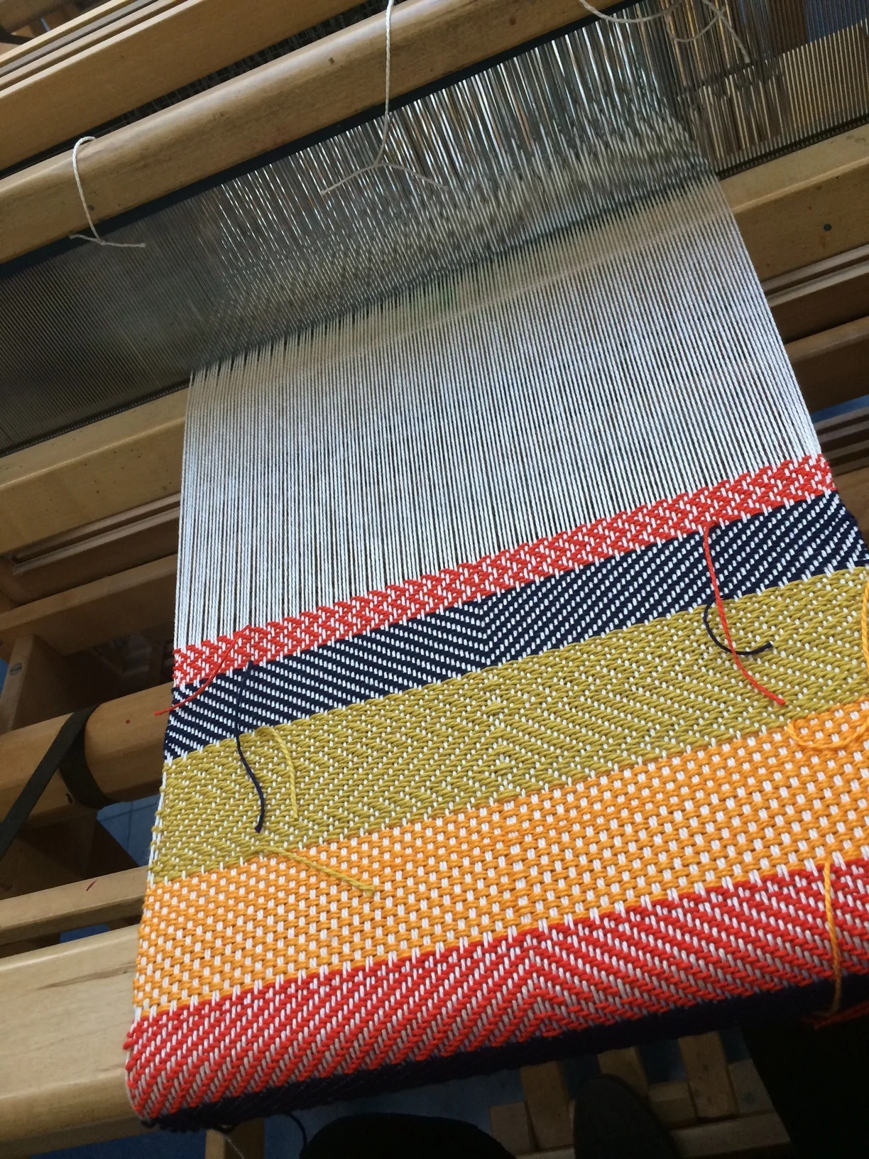
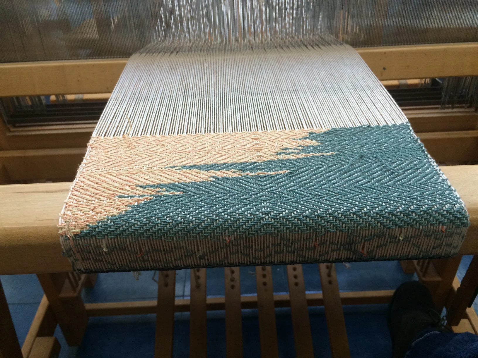
This was my first venture in the world of traditional weaving. The first colored piece was a study in the different types of weaves, and the second was more conceptual in that it was based on my heritage. I am 5/8 German, 2/8 Swedish, and the last 1/8 includes everything else, so the weaving is broken up into eight parts. This allowed opportunities for me to continue to experiment and push those techniques further. The color choices help differentiate which sections belong to where. Room for improvement, but very enjoyable!
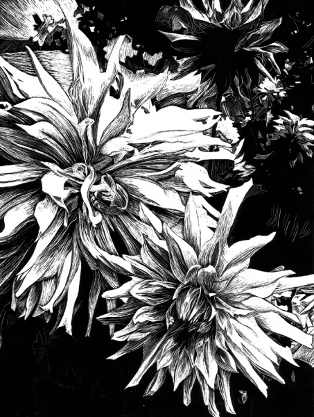
A scratch board piece which I enjoy as a process because mistakes can’t be erased or undone, but integrated moving forward.
Silk Screen
13in x 18in
The magazine, #FLAWLESS, steamed from an exploration in appropriation and a strong interest in the magazine industry. I was drawn to a black and white photograph from the vintage Vogue books from 1956 of a model that looks as if she has no cares in the world. I wanted to put her into a new, ironic context in a humorous but powerful way in the form of a contemporary magazine cover setting. There is a floral background to accompany her laissez-faire attitude. She needed some edge. I took some headlines and subheadings from sexist 1950's advertisements for the cover of the magazine and put a contemporary spin on them by using hash tags of Beyoncé lyrics on top as commentary on the ridiculousness of the headings. The title, #FLAWLESS, comes from her song which speaks to the expectations women have in different aspects of life.